
Stash StockParty
MY ROLE
User Research
UX Design
UI Design
OVERVIEW
Stash StockParty
MY ROLE
User Research
UX Design
UI Design
OVERVIEW
User research, UX audit, wireframes, LoFi to HiFi designs, prototypes, and user tests were conducted for the redesign of a digital product feature aimed at enhancing Stash users' understanding of StockParty. The objective was to create a more seamless, understandable, and connected experience.
PROBLEM STATEMENT
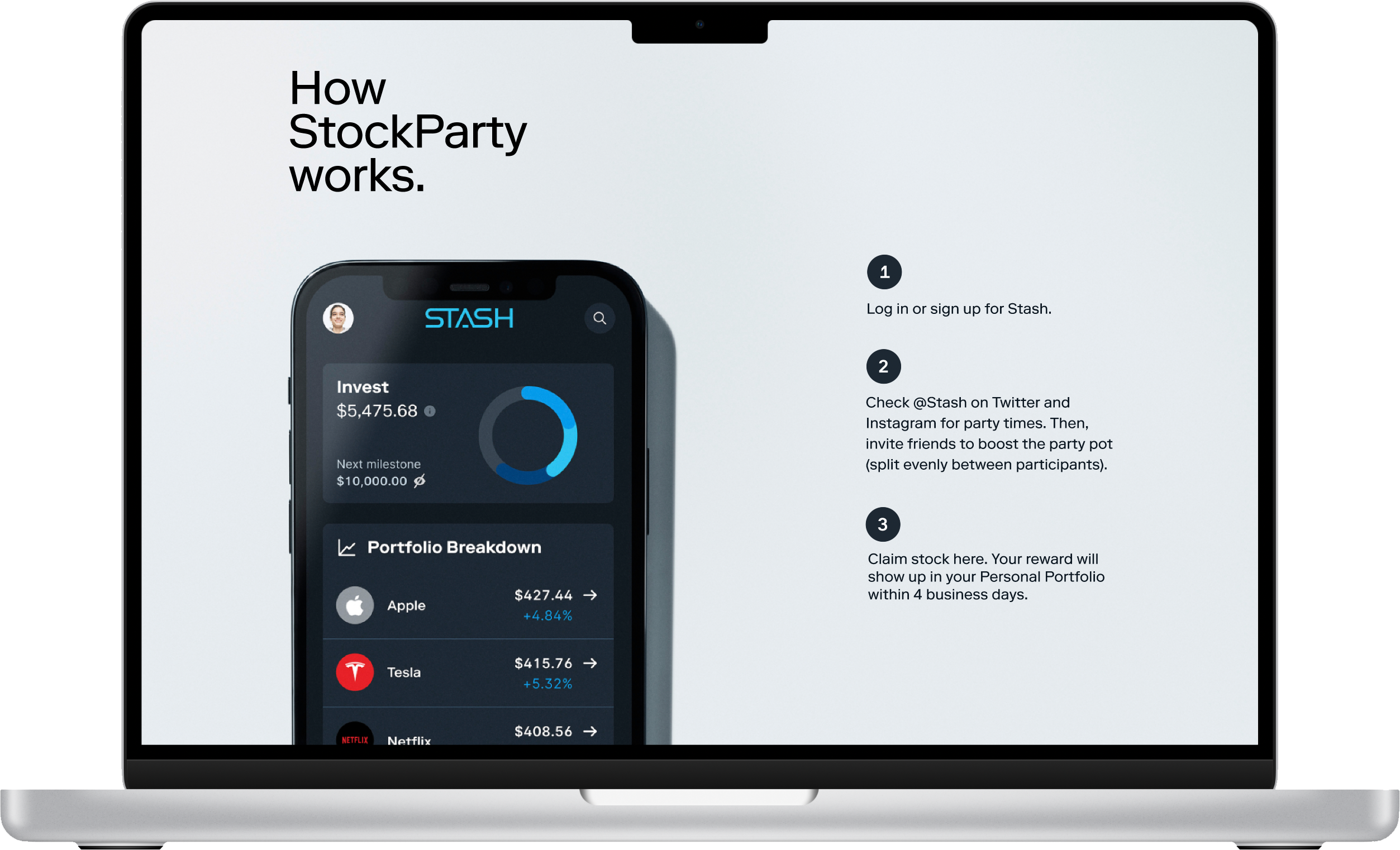
Stash StockParty is a feature provided by Stash that allows customers to receive portions of offered stocks. The quantity of stock allocated is determined by the number of attendees at the StockParty, with a larger prize pot being divided among a greater number of participants.
There are two categories of users: Prospects and Subscribers.
Prospects have a user experience that lacks awareness about StockParty's nature and functionality, and they may also be uncertain about the purpose of Stash itself. Subscribers encounter a cumbersome experience as they struggle to locate their desired information, despite the straightforward nature of the concept.
APPROACH
Conducted quantitative and qualitative research, performed a UX Audit, and conducted user and stakeholder interviews to identify roadblocks in the Stash StockParty Experience.
Leveraging the user experience data, I implemented user-tested design solutions to enhance the Stash StockParty experience, making it more seamless, comprehensible, and interconnected.
Discovery
RESEARCH
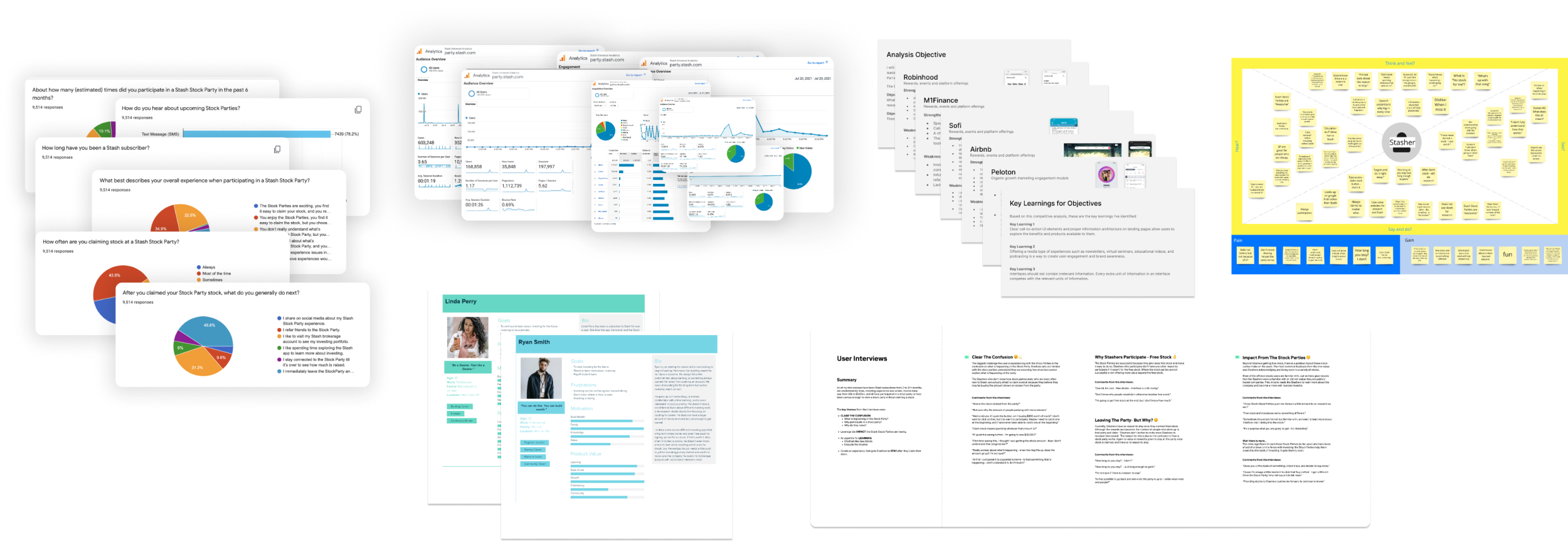
Research Methods

User Interviews
![]()
Surveys
![]()
Data Analytics

Personas

Competitor Analysis
RESEARCH SYNTHESIS
CLEAR THE CONFUSION
What is happening at the StockParty?
Users need more understanding of what happens at the Stock Parties.
Why participate in a stock party to refer?
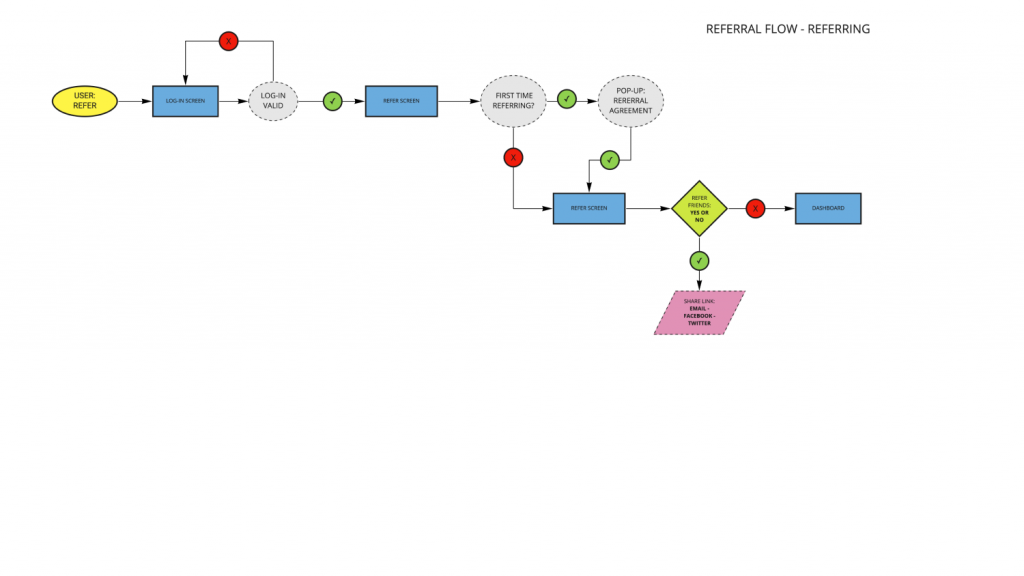
The referral link experience does not mention anything about a StockParty, and the bonus reward needs to be clarified as to why the user should make an effort to refer.
THE OPPORTUNITY
Why do users leave so quickly from the StockParty once they claim their stock?
The overall experience needs to include a user experience beyond just claiming stock; there is no engagement and not enough value to encourage Stashers' to refer or share more.
What was a key theme that continued to come up in the user interviews?
Leverage the impact of the Stash StockParty by educating their users.
UX AUDIT
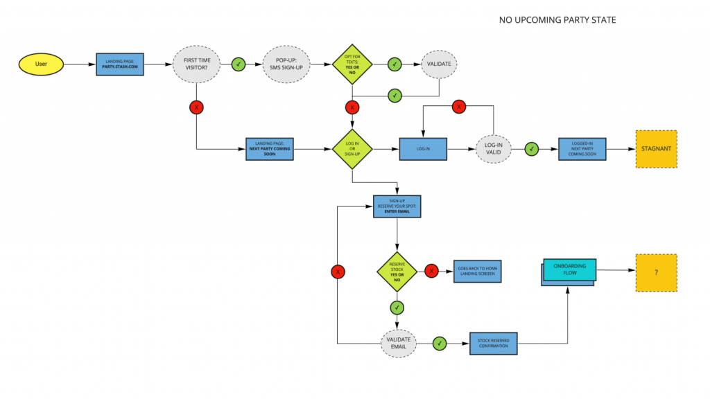
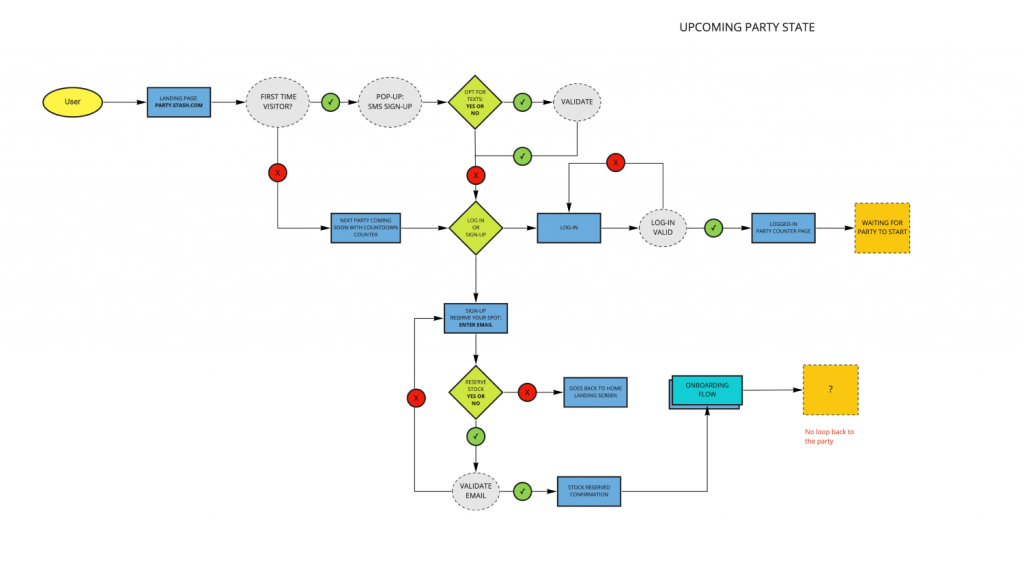
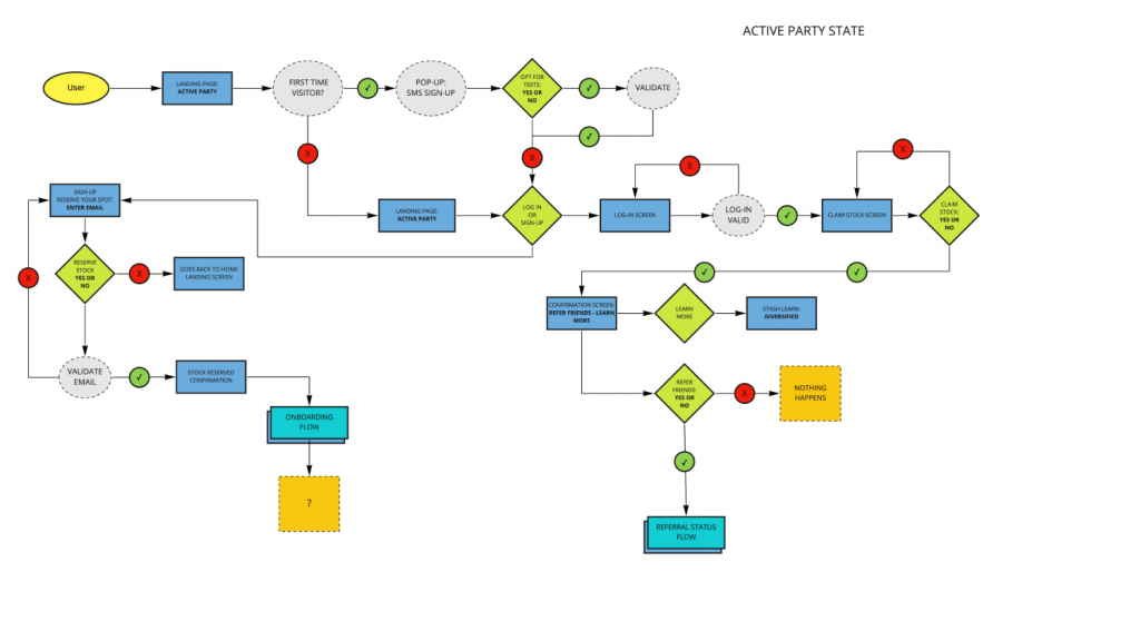
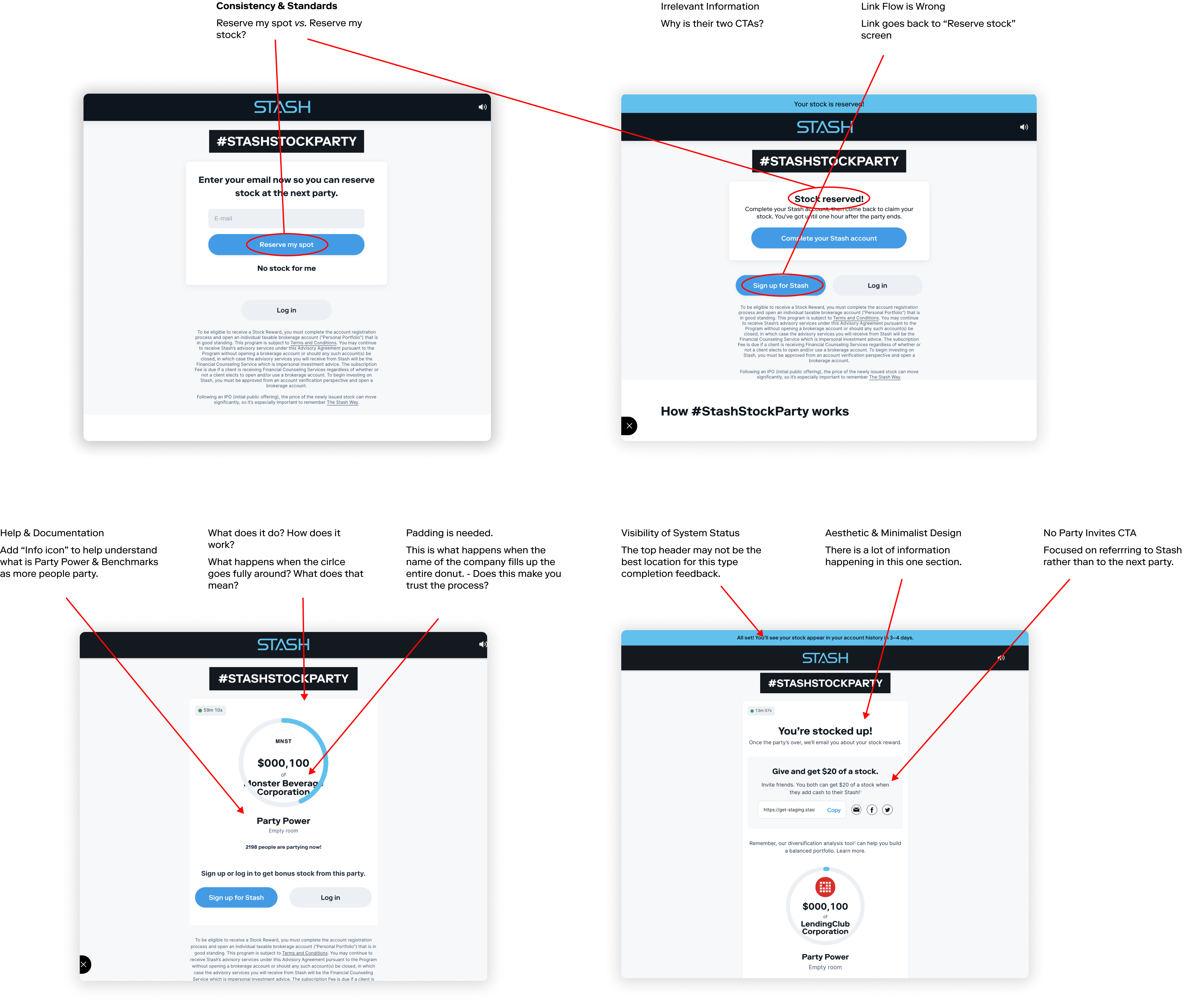
Several user experience issues were flagged such as visibility of system status, broken user flows, user control and freedom, consistency and standards, lack of error prevention, and help and documentation.

DEFINING THE PROBLEM
Addressing the open questions with How Might We Statements...


Design
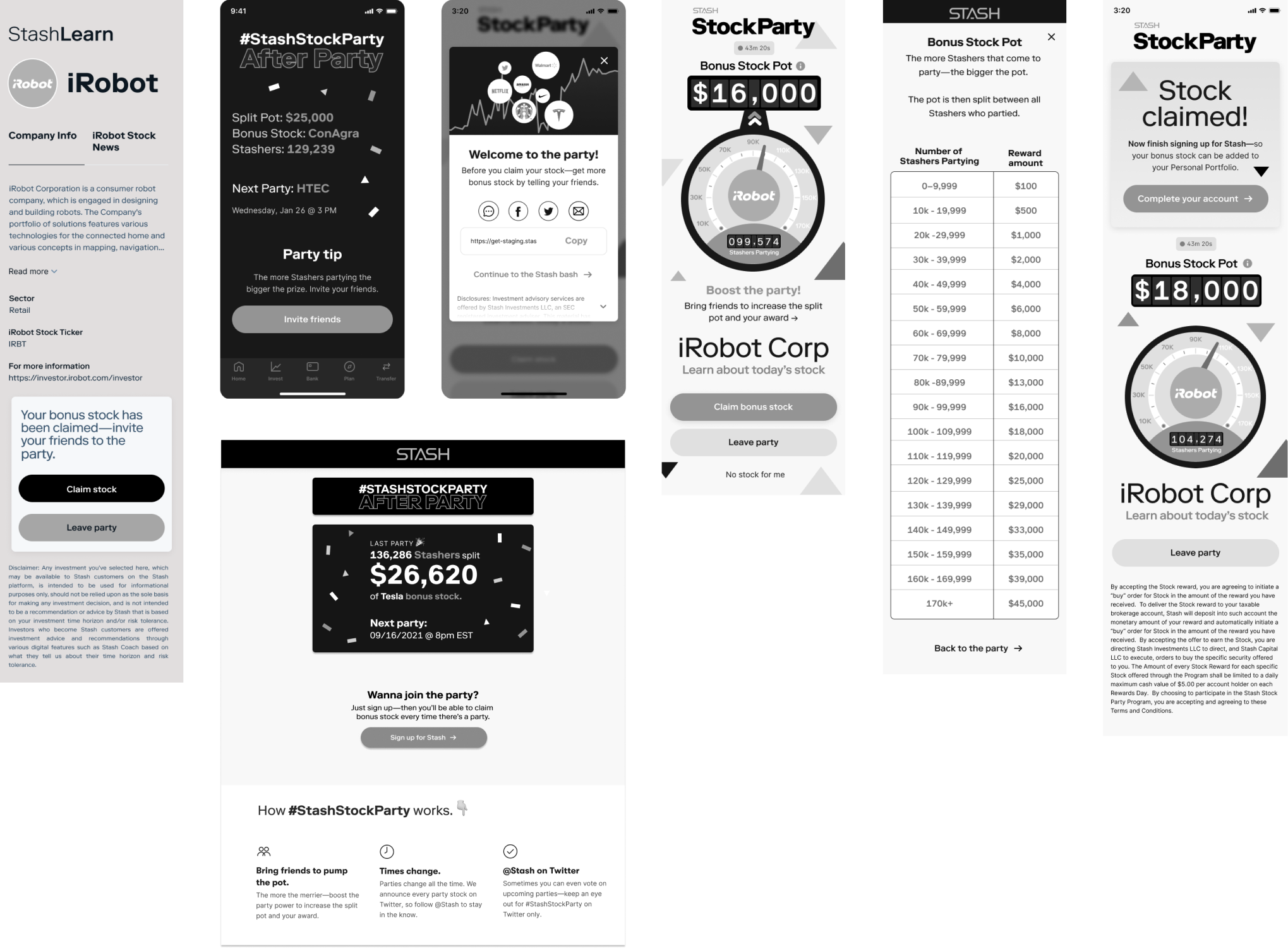
LOW FIDELITY DESIGNS
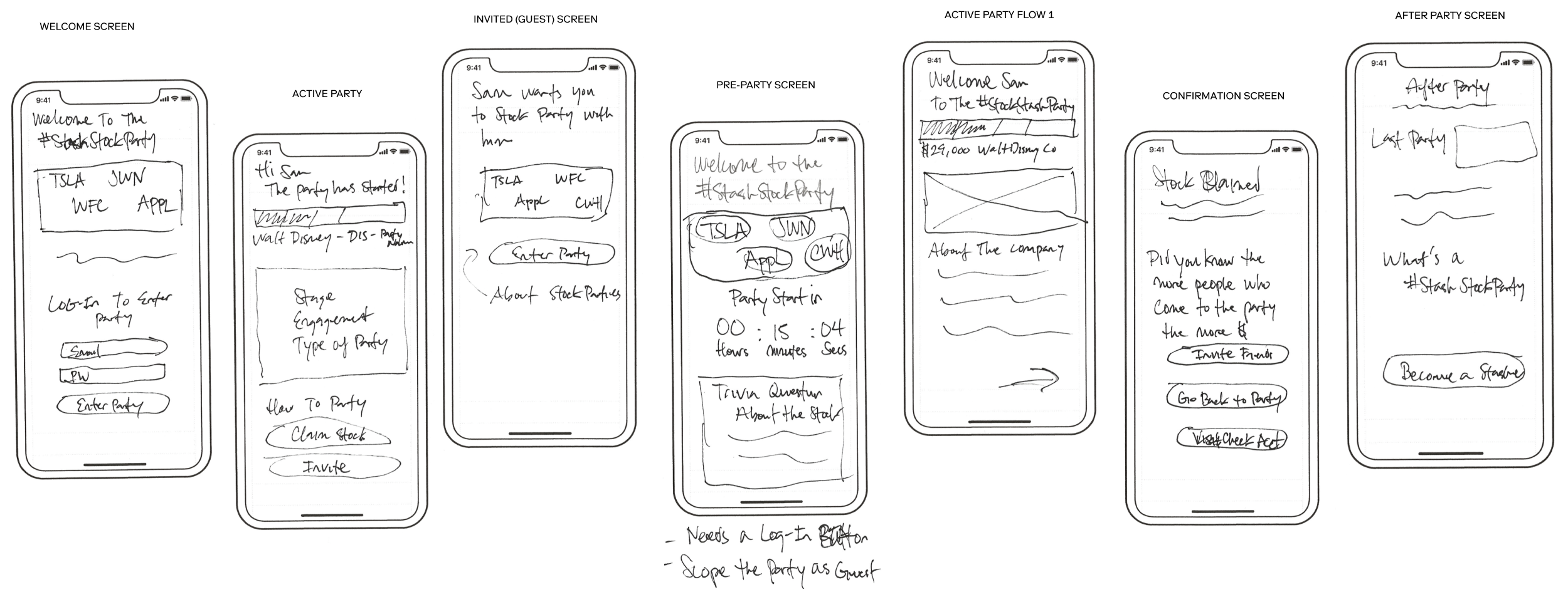
The user data from research was utilized to develop sketched design solutions aimed at achieving a frictionless and informative user experience.
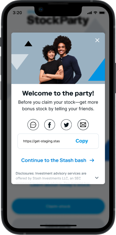
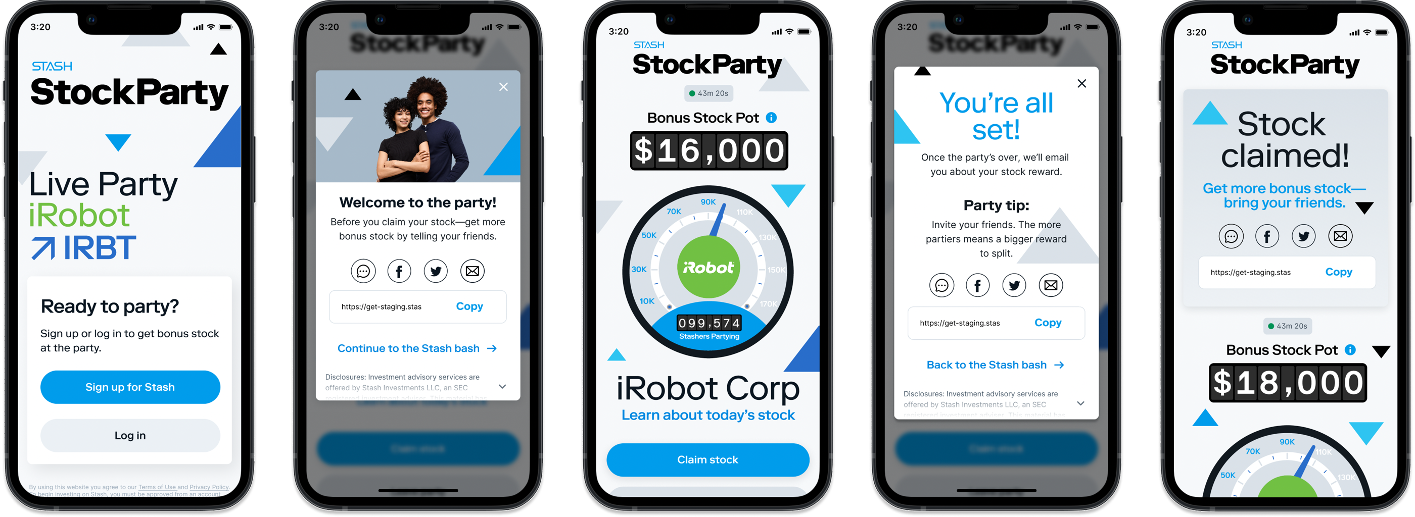
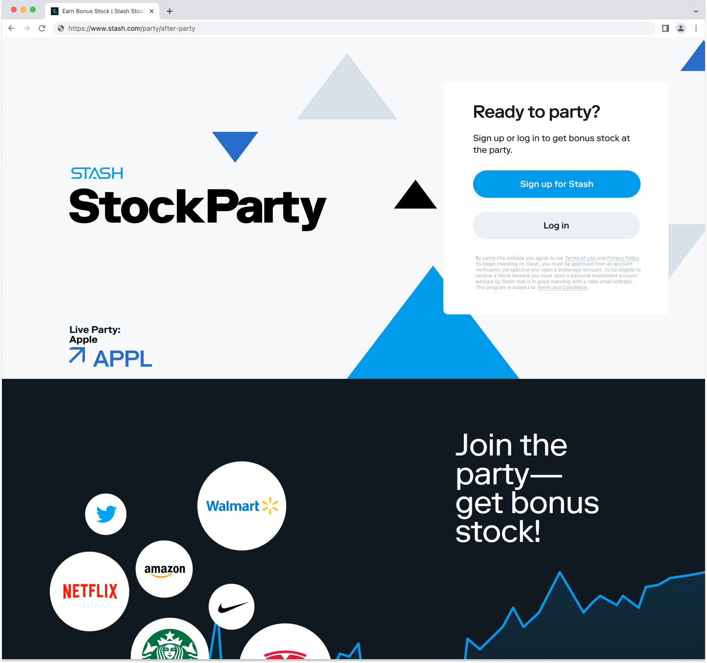
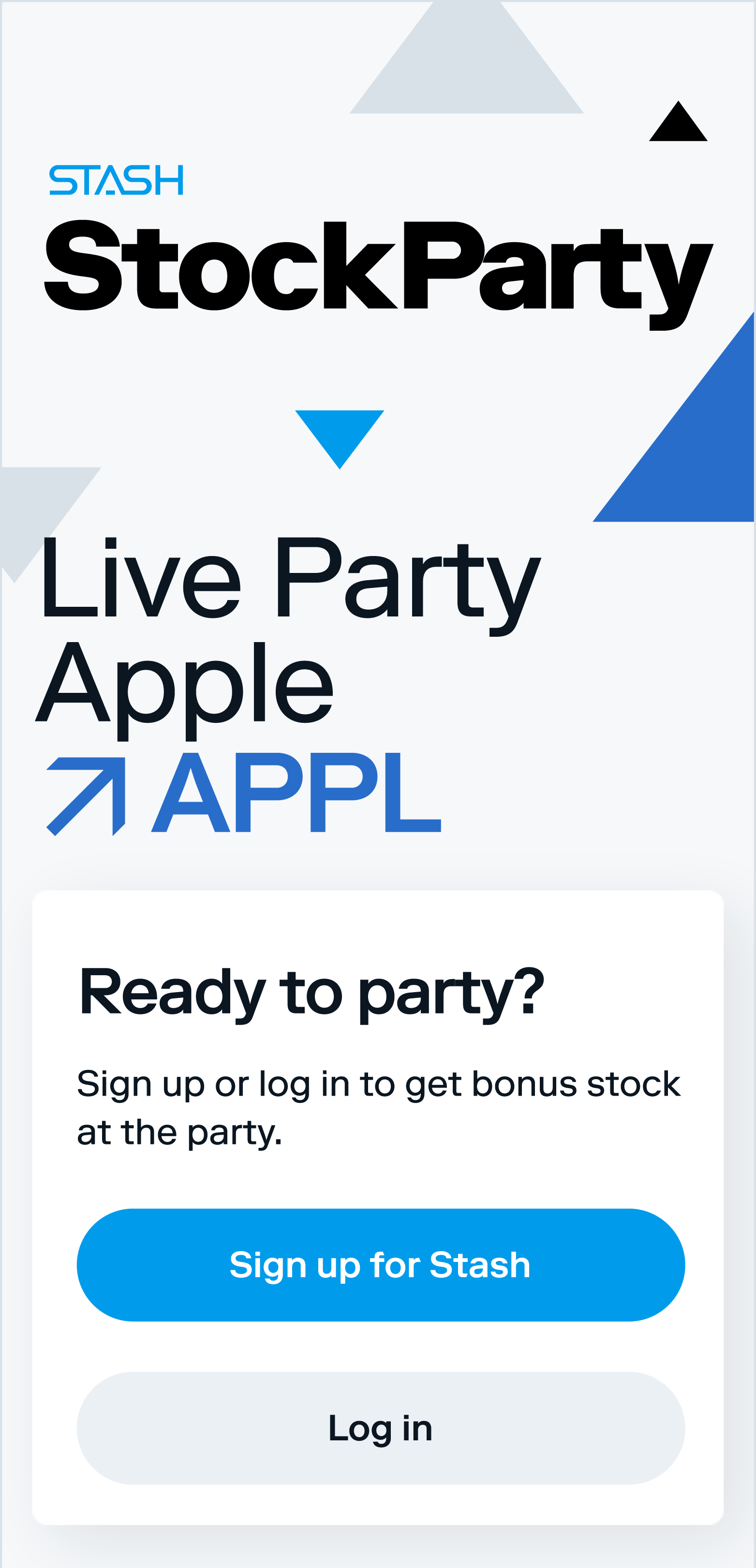
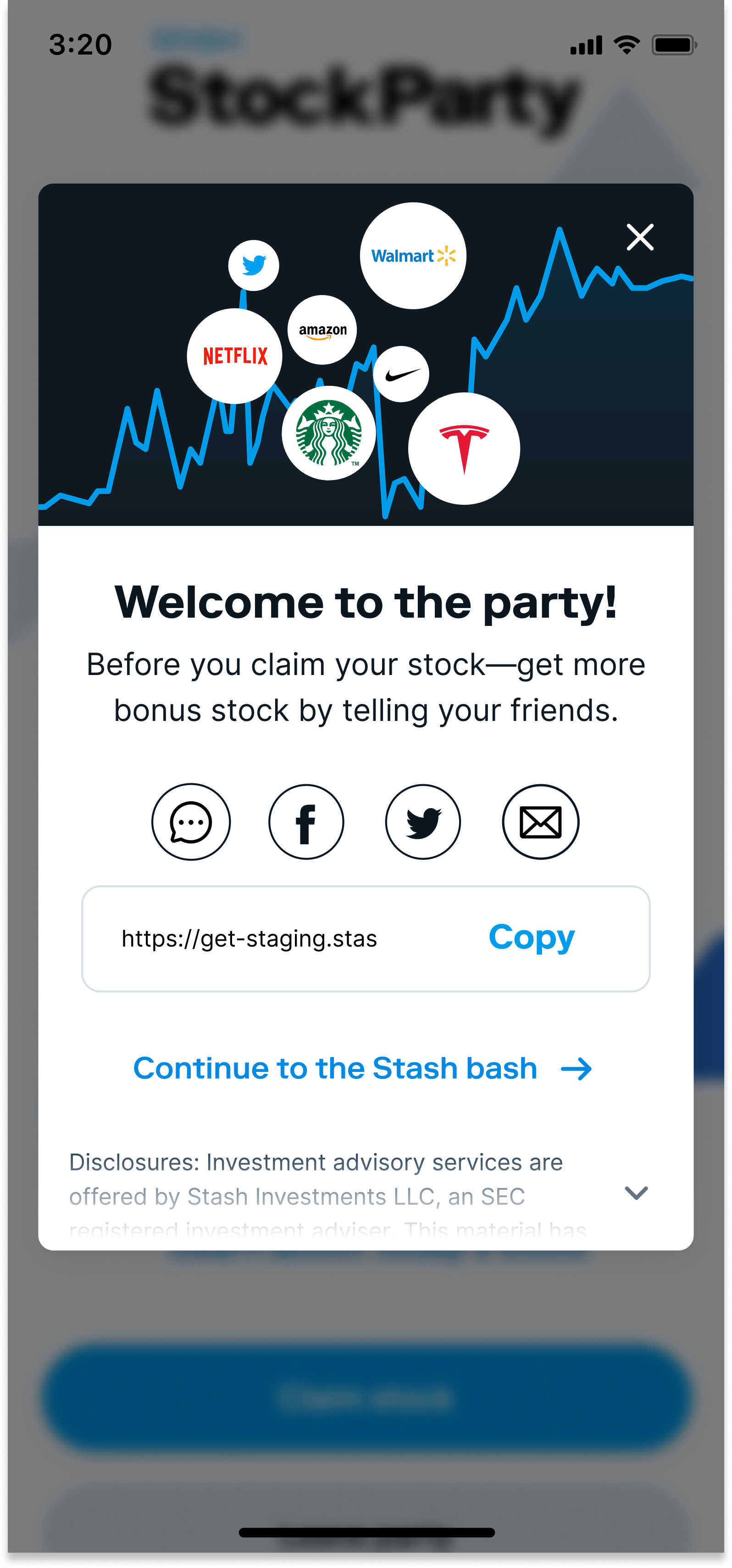
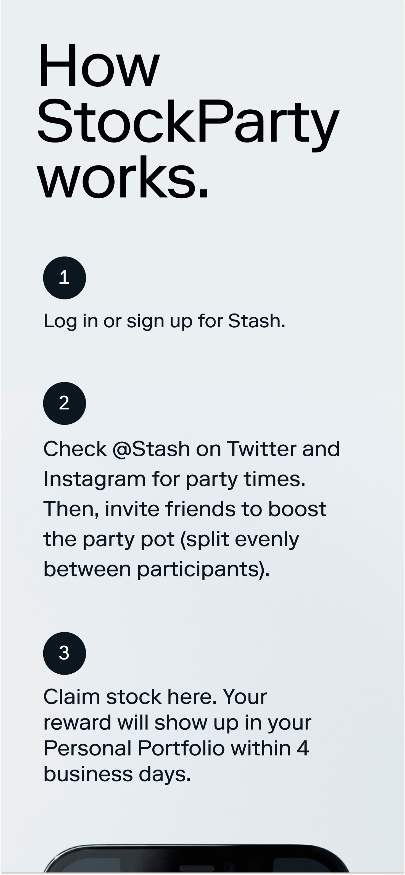
HIGH FIDELITY DESIGNS
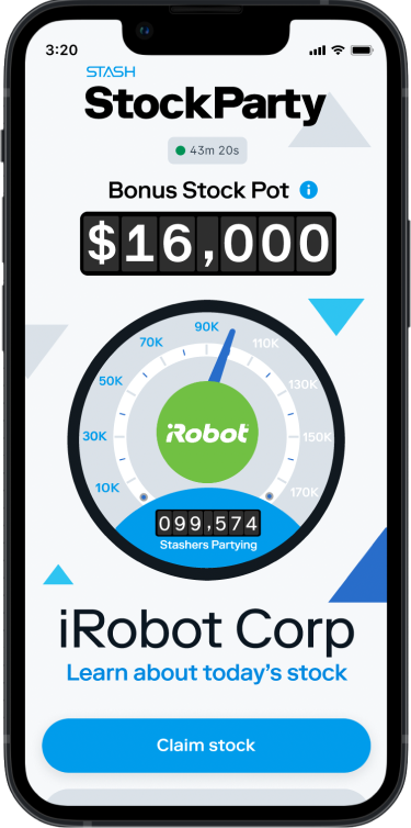
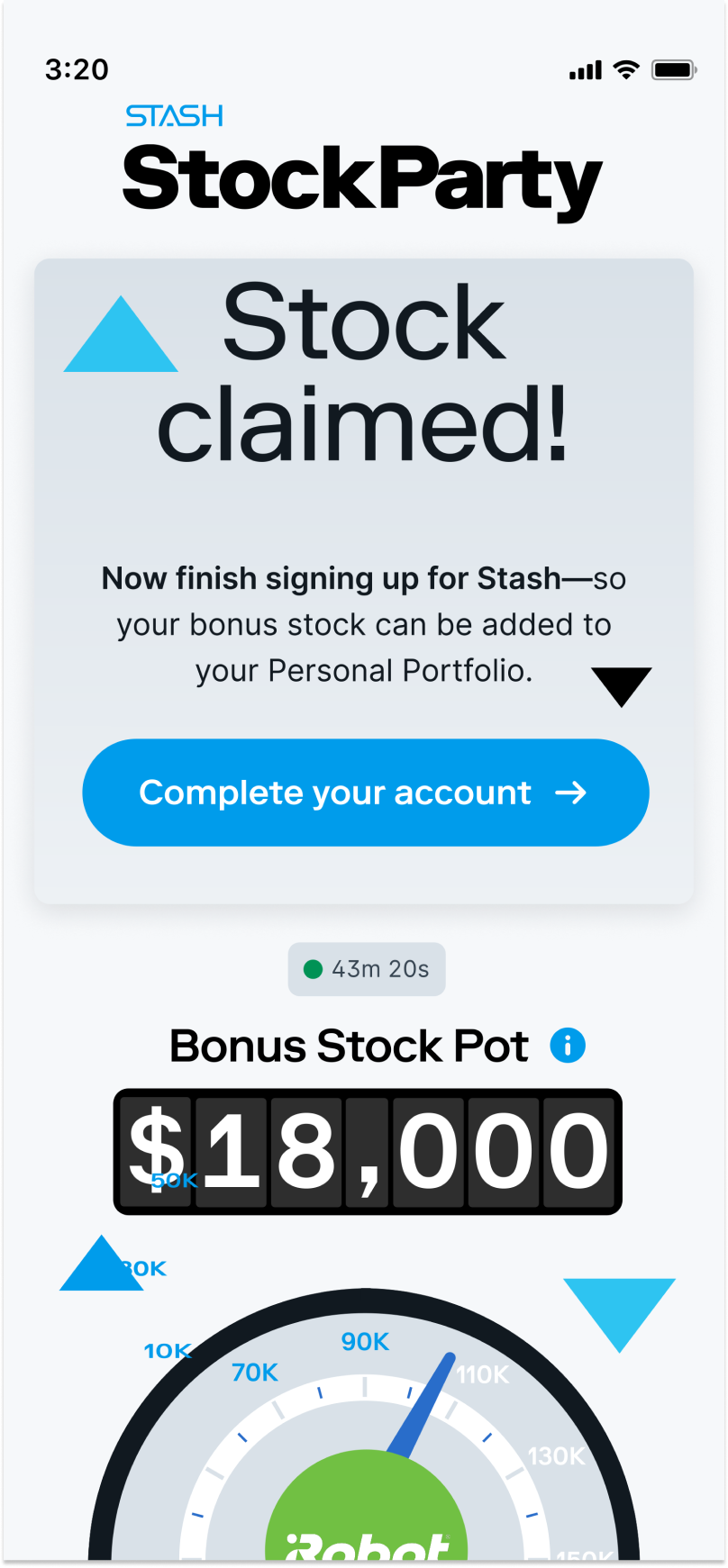
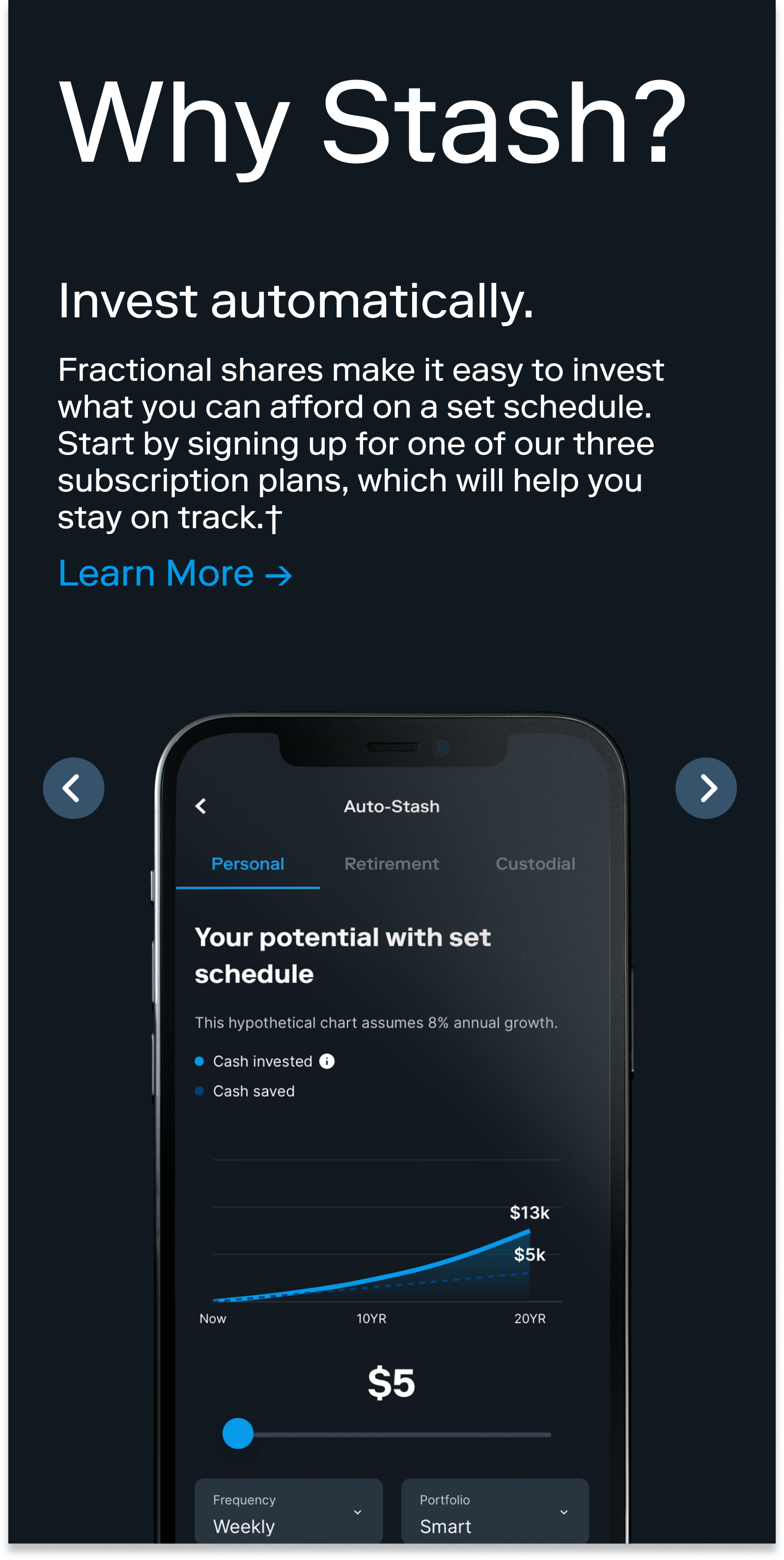
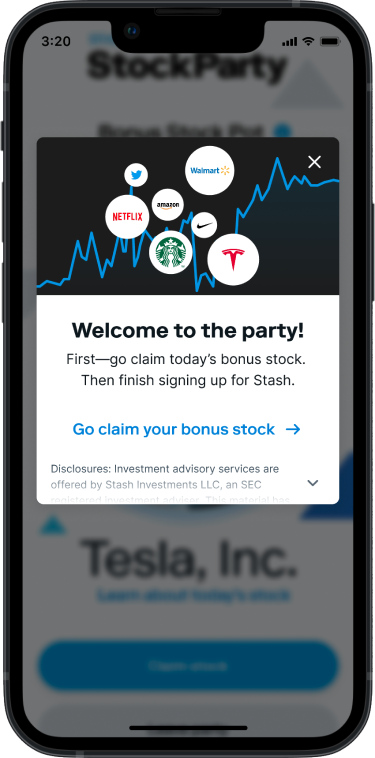
The design framework focused on addressing the experience roadblocks of both current and prospective users, with an emphasis on enhancing the clarity of content and UI elements, while also fostering increased engagement during the party.



Validate
PROTOTYPE
I transferred the high-fidelity mockups into an interactive prototypes using Figma.
Subscriber Prototype

Prospect Prototype
USABILITY TESTS
I conducted ten remote usability tests using Zoom, involving a diverse group of participants consisting of five current Stash users and five prospects. The aim was to gain insights into potential user issues when interacting with the product and assess the overall user experience and comprehension of Stash StockParty.
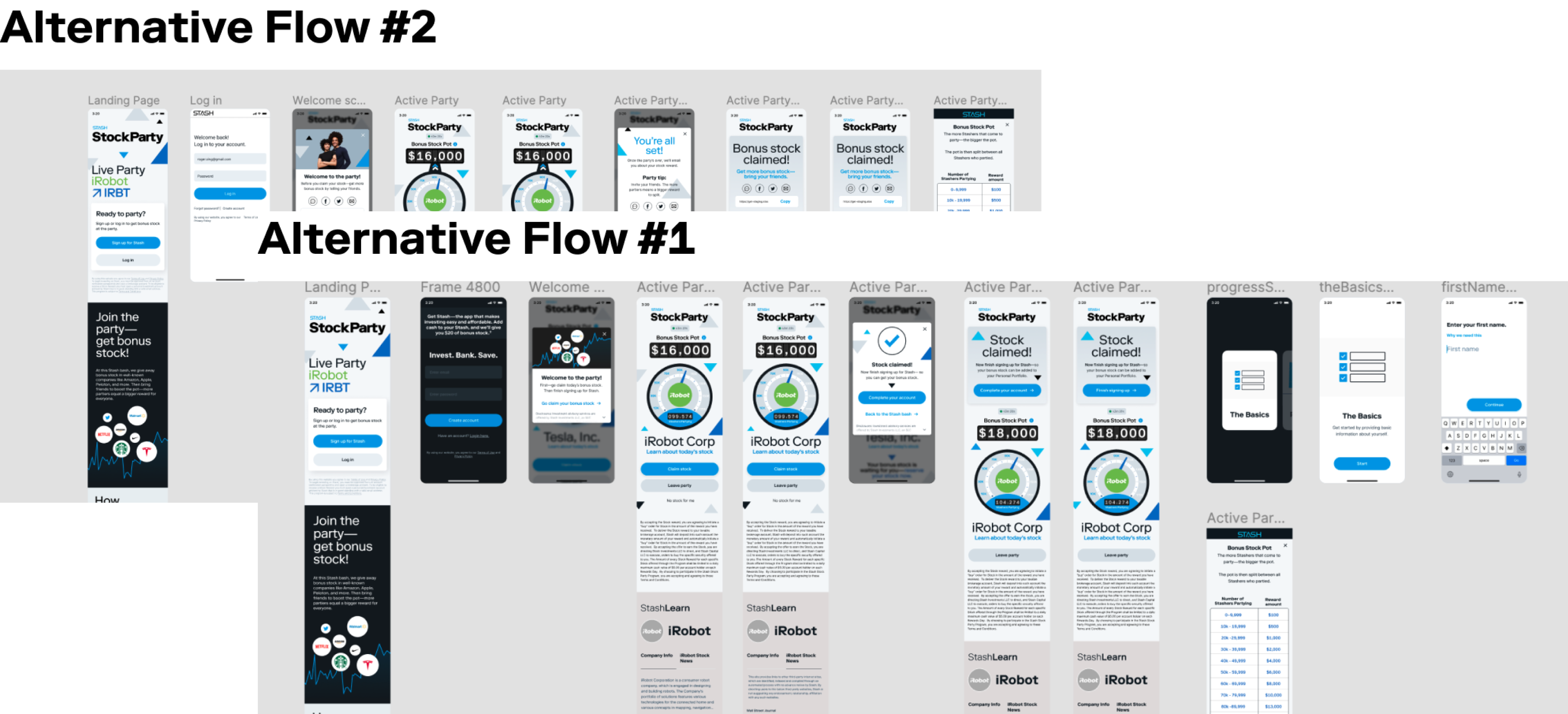
The testing users unanimously expressed agreement that the new alternative flow UI was aesthetically superior, informative, and provided a more seamless experience compared to the existing Stasher and prospect flow.
Stashers
All five Stashers expressed a preference for flow two, while also indicating their interest in receiving personalized status updates on referrals within the entry point modal of Flow 3, instead of a "Share with friends" modal.
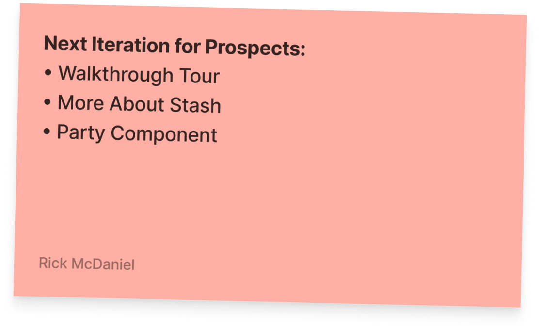
Prospects
Among the five users, four of them favored flows 1 and 2 over flow 3. They shared the perception that these flows made them feel like they were signing up for Stash as a whole, rather than solely for the StockParty.
Design Enhancements
Every user acknowledged the StashLearn module as being "really helpful" and expressed appreciation for the provided information, particularly when it concerned unfamiliar stocks.
Additionally, all users agreed that the "Boost the Party" copy in Flow 3 aided their comprehension of how the stock party operates and the rationale behind referring more individuals to participate.
NEXT STEPS
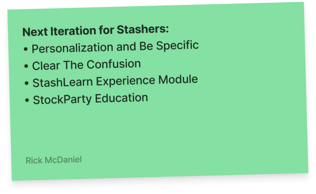
Stashers
The feedback highlighted the importance of providing specific information on the number of prospects that Stashers should refer and the incentives they would receive for making referrals.
Stashers expressed their desire to understand precisely how they can impact the party and requested regular status updates on their referrals.
Prospects
The feedback indicated the ongoing need to comprehend how the pot is distributed, the visual representation of factors driving the pot to the next level and the definition of the next level itself, as well as the importance of having a clear understanding of Stash investment accounts.
LEARNINGS
Participating in this project allowed me to utilize my UX/UI skills, leadership abilities, and interpersonal skills to effectively tackle numerous user experiences and technical challenges associated with the StockParty. By addressing these issues, Stash can now leverage the StockParty successfully.
Collaboration within a Startup
Maintaining ongoing communication with developers, conducting design reviews with product owners, and adapting to the branding team and other Stash product teams were crucial aspects of the design process. These collaborative efforts were essential in redesigning a digital experience that is seamless, understandable, and interconnected.
User Types and Conducting User Tests
The confirmation emerged that a user flow may appear seamless and understandable for one user type, while a completely new user flow is necessary for a different user. Assumptions are an inherent part of the design and iteration process, but comprehensive user testing eliminates assumptions by relying on confirmed user data.
The Power of Subtle Enhancements
The inclusion of concise and purposeful copy and UI elements within the StockParty experience significantly enhanced the overall understanding of what a StockParty entails.
UX RESEARCH & UX ARCHITECT
FinCompliance
Compliance, consulting, and business management solutions for boutique investment firms.


