PROJECT
Soundsly
MY ROLE
User Research
UX Design
UI Design
OVERVIEW
TEAM PROJECT
Soundsly
MY ROLE
User Research
UX Design
UI Design
OVERVIEW
Conducted UX research, information architecture, prototype, and user tests for an experience that will allow users to subscribe and pay a monthly fee.
PROBLEM STATEMENT
A startup company launched a media product two years ago as a freemium model and is now looking to monetize on a premium (paid) product model.
How can I design an experience that will allow users to subscribe and pay a monthly fee?

I created a project plan that helped me stay organized. It was an essential tool to use while working under a compressed timeline.

Secondary Research
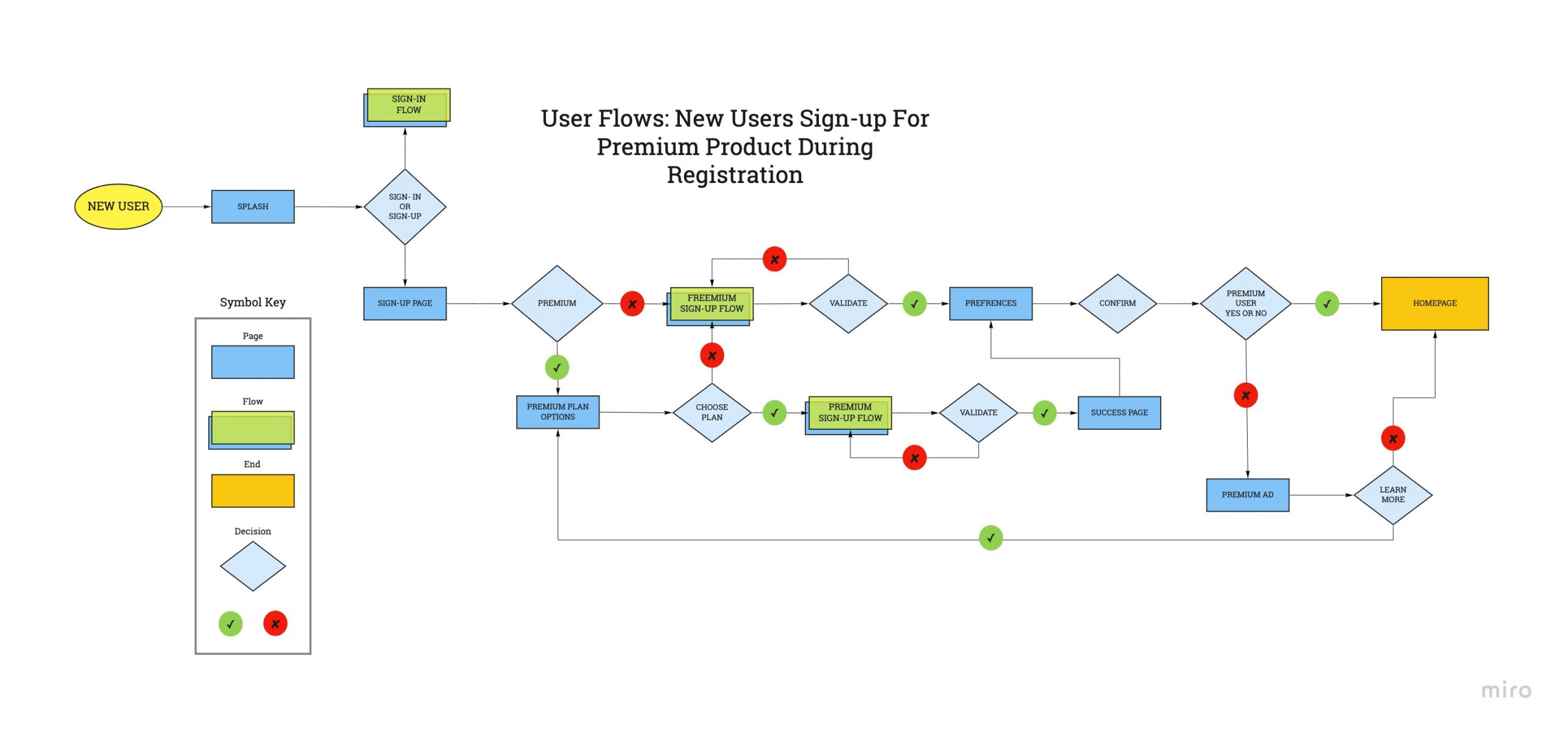
Userflows

Sketching

Wireframes

Usability Testing
Prototype
Research Methods
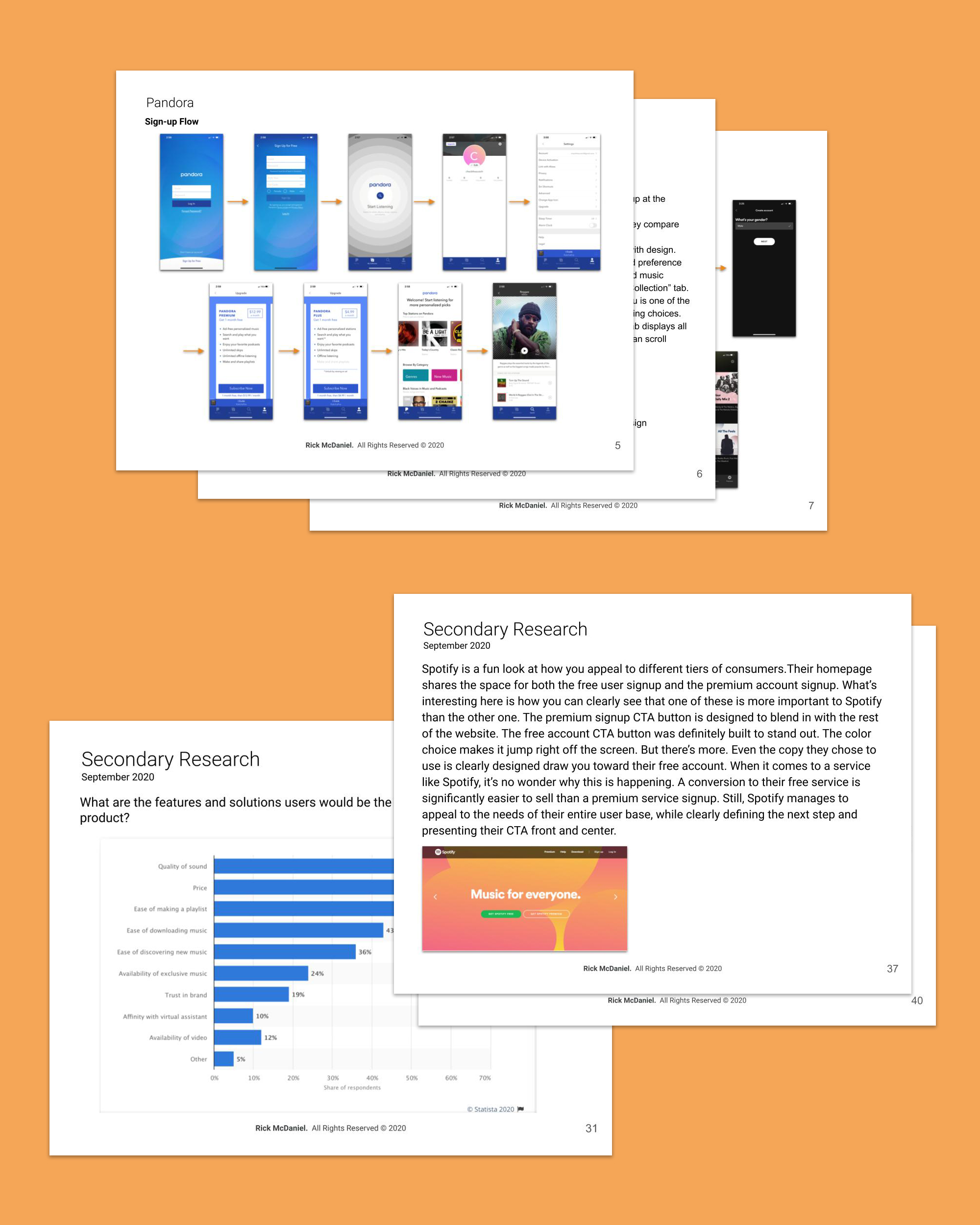
I conducted online Secondary Research on industry leaders, their freemium to premium business models, and the best usage of CTA UI elements for conversions.
Synthesising
The most important features of a music streaming service are sound, price, and convenience. The less important features are brand trust and video availability.
The reason why users don’t upgrade from the freemium products is the free product doesn’t have enough impact on someone’s life, the free plan is sufficient enough, the onboarding process isn’t user friendly and pricing is not clear.
The premium features I focused on are no ads, offline listening, unlimited skips, and unique features such as lyrics, music identifier, and social integration.
A simple user-friendly CTA is a key to success in reaching the business conversion goal.
DESIGN
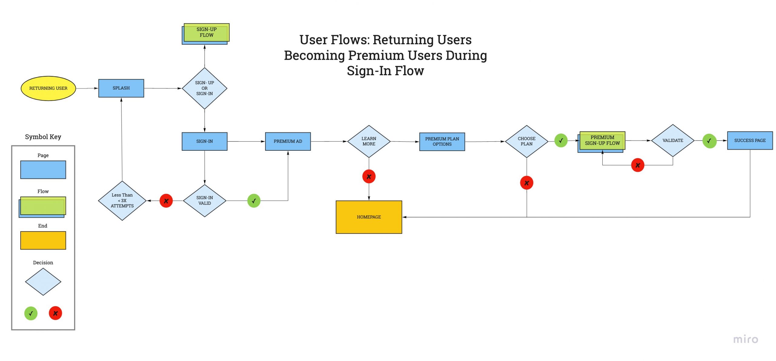
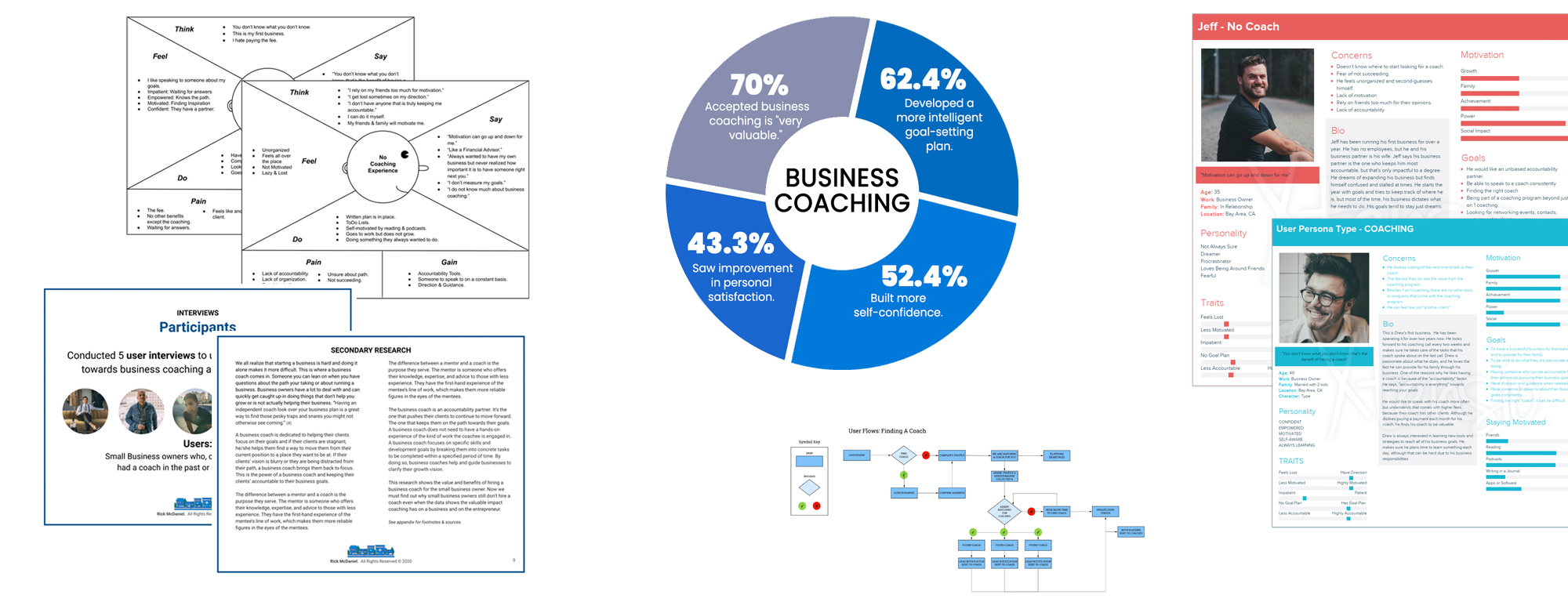
I identified the three user flows that would be the red routes to match their business objectives:
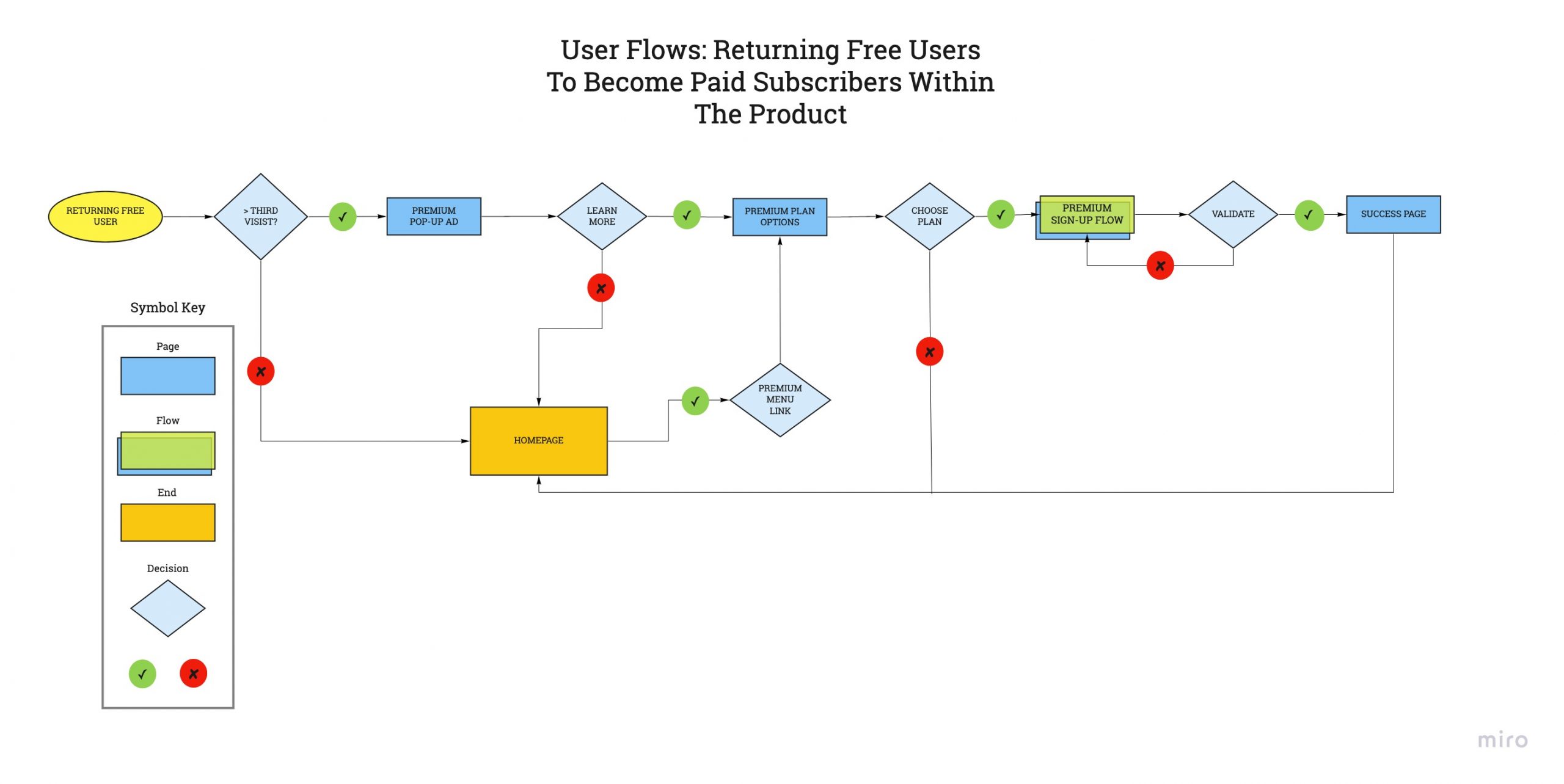
Returning free users become premium users in the sign-in flow.
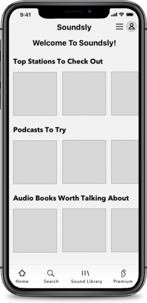
I took my red route user flows and translated them into the low fidelity design screens that the user will actually interact with as they move through the flows.
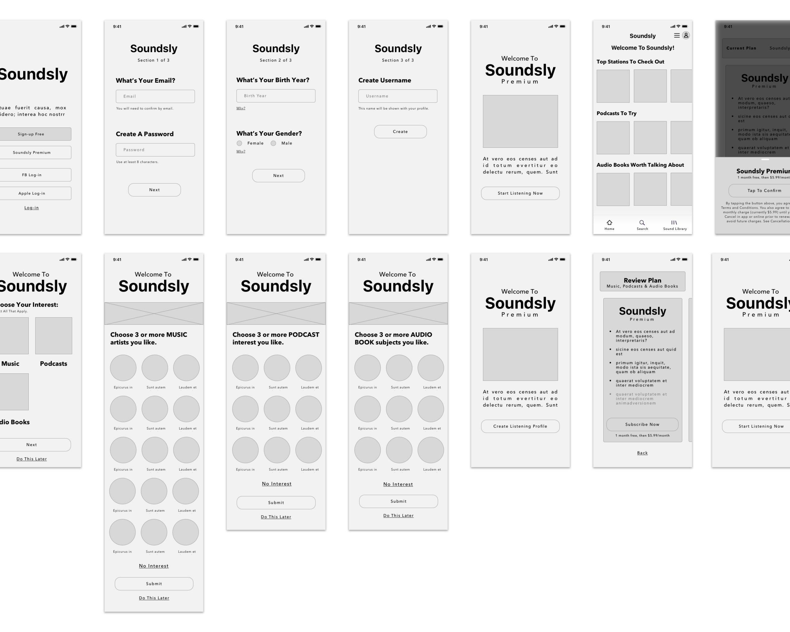
Synopsis
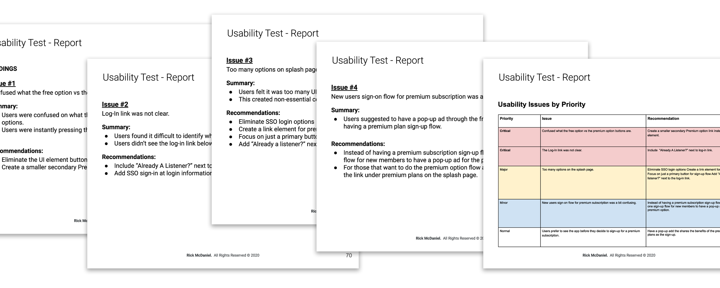
After conducting five usability tests I adjusted all “critical” and “major” issues upon this iteration.
The following usability issues were addressed:
- Confused about what the free option vs the premium option buttons is.
- The log-in link was not clear.
- Too many options on the splash page.
- The new users' sign-on flow for premium subscriptions was a bit confusing.
High Fidelity Design
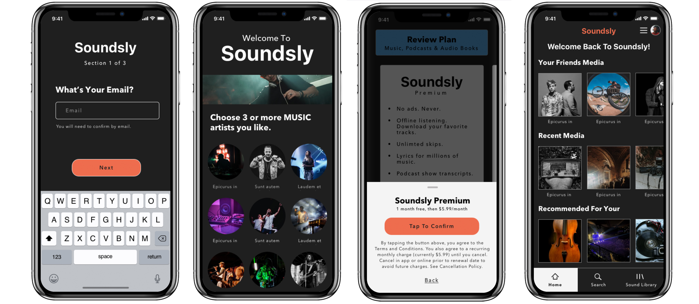
I used the insights and feedback from my low fidelity usability test and adjusted the designs.
I particularly focused on the splash page and how the interactive prototype will flow for free vs premium users.
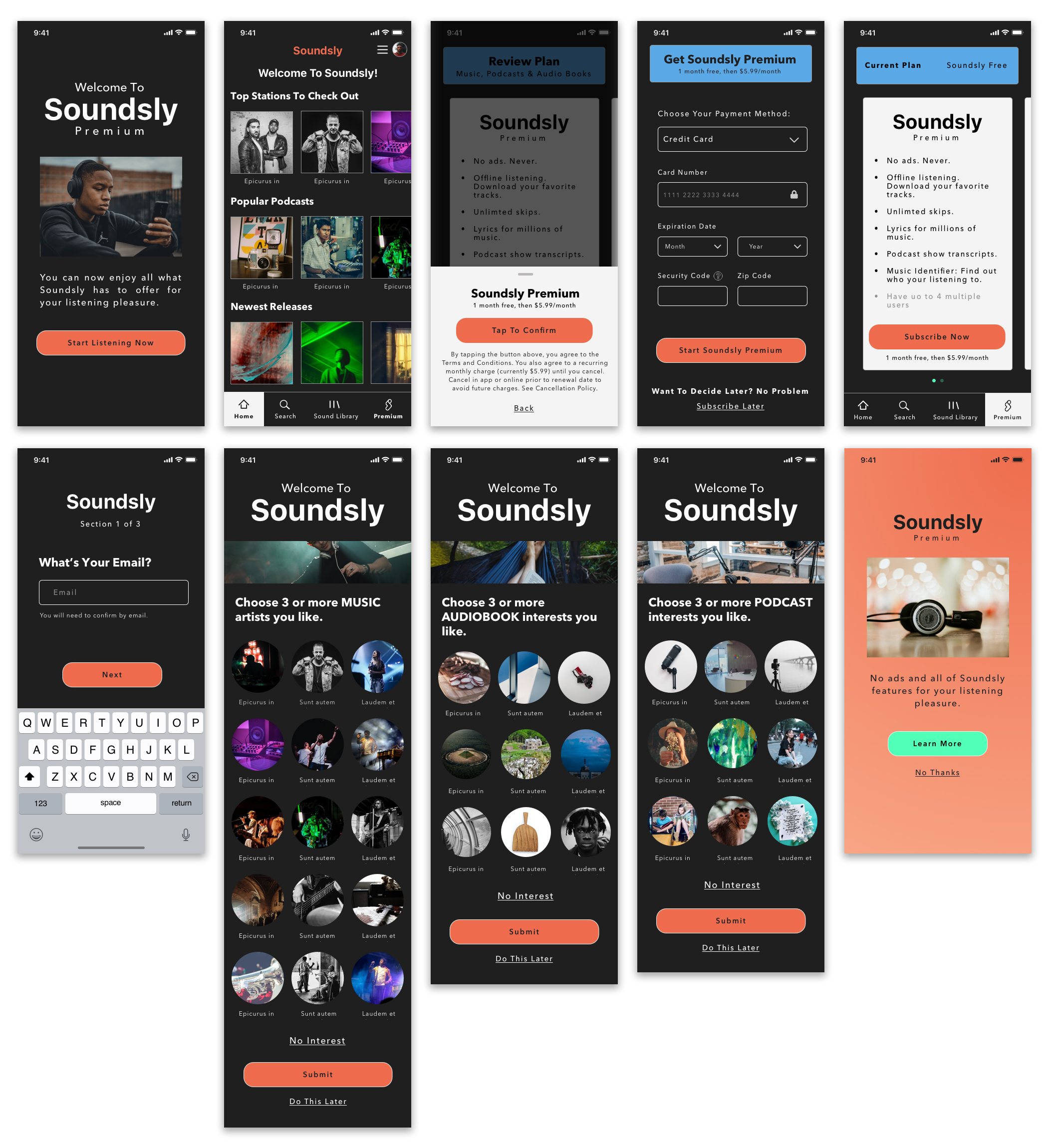
After focusing on the payment flow and the splash page, I transferred the high fidelity design into an interactive prototype using Marvel.

Synopsis
- Payment system
- Sign-up free is unclear between Facebook & Apple sign-up.
- Grammar for “Audio Book” preferences.
- Username, email, and password flow stalled users.
LEARNINGS
Reduce Congnitve Load
The splash page screen, in particular, had the users thinking way too much on what direction they wanted to go. I took the low fidelity design user feedback and iterated the design into high fidelity designs by creating more clarity in signing up as a free user or if the user was interested in a premium plan.
Put Users in Control of the Interface
The payment flow gives the users control of the interface and how they want to be a customer of Soundsly.
Make it Easy to Understand
Some of the feedback I received was wanting to have the option to pay via credit card instead of apple. I decided that a proper payment flow was critical to making the flow seamless with less cognitive load.
UX RESEARCH & DESIGN
RiseOne
Helping business owners accomplish their goals.


