TEAM PROJECT
FINCompliance
MY ROLE
User Research
UX Architect
OVERVIEW
Part of a team project where I conducted UX research, and focused on information architecture to identify solutions for a better user experience on the FINCompliance platform.
TEAM PROJECT
RiseOne
MY ROLE
User Research
UX Design
UI Design
OVERVIEW
Conducted UX research, information architecture, prototype, and user tests to create and design a digital product that helps entrepreneurs find business coaches to help them achieve their goals.
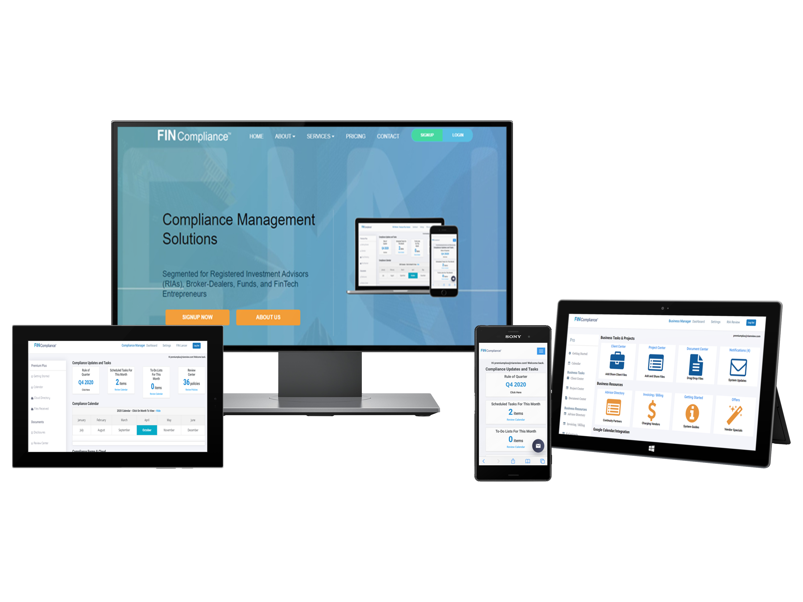
PROBLEM STATEMENT
FINCompliance is a consortium of compliance, consulting, and business management solutions to help investment firms structure, maintain, and develop their regulatory review programs.
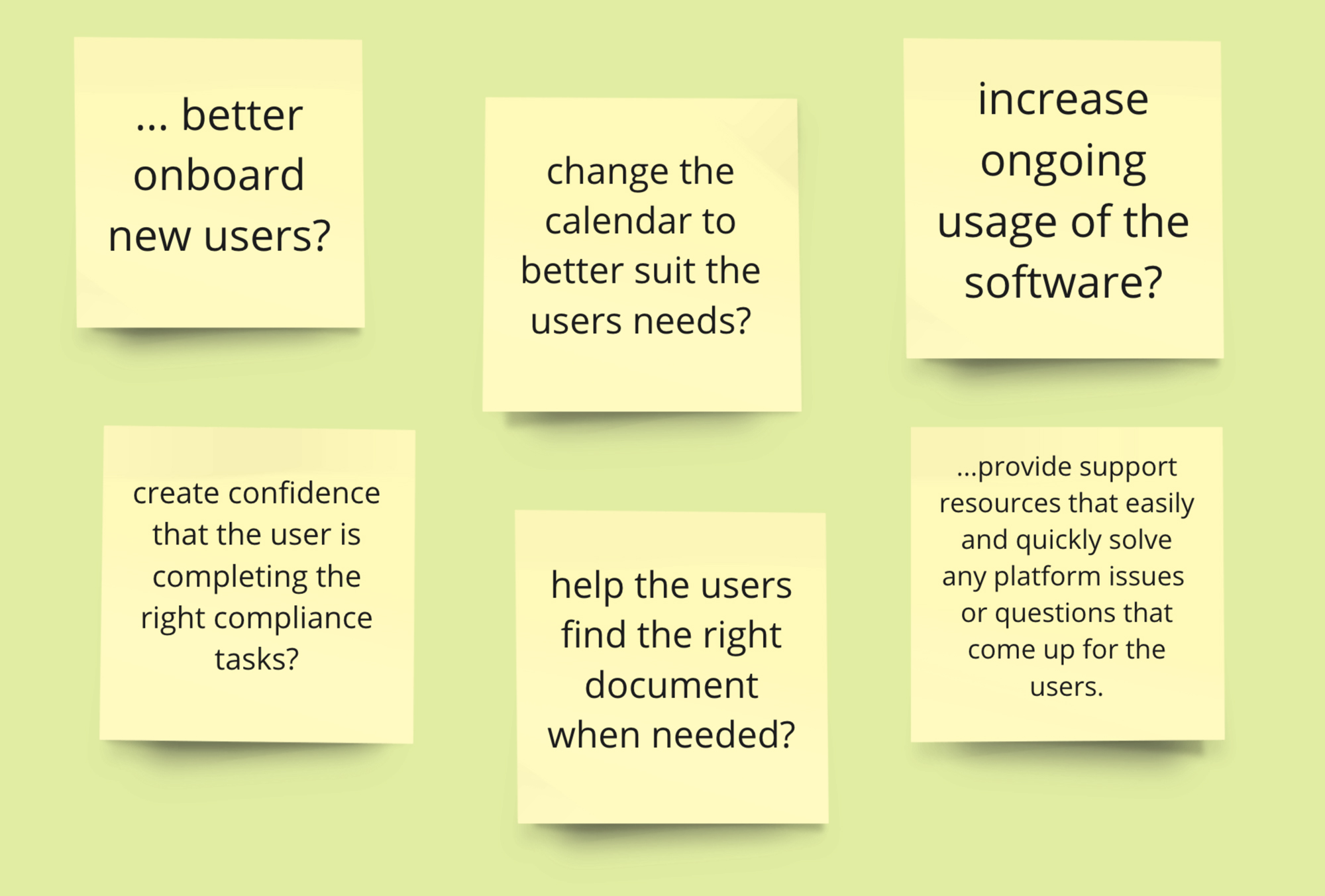
How could we improve the likelihood of ongoing usage of the platform, and what onboarding solutions could provide a better user experience on the FINCompliance platform.
APPROACH
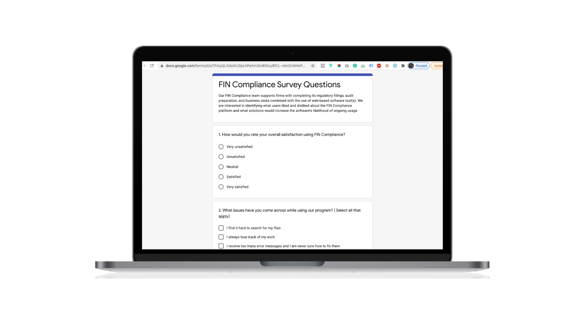
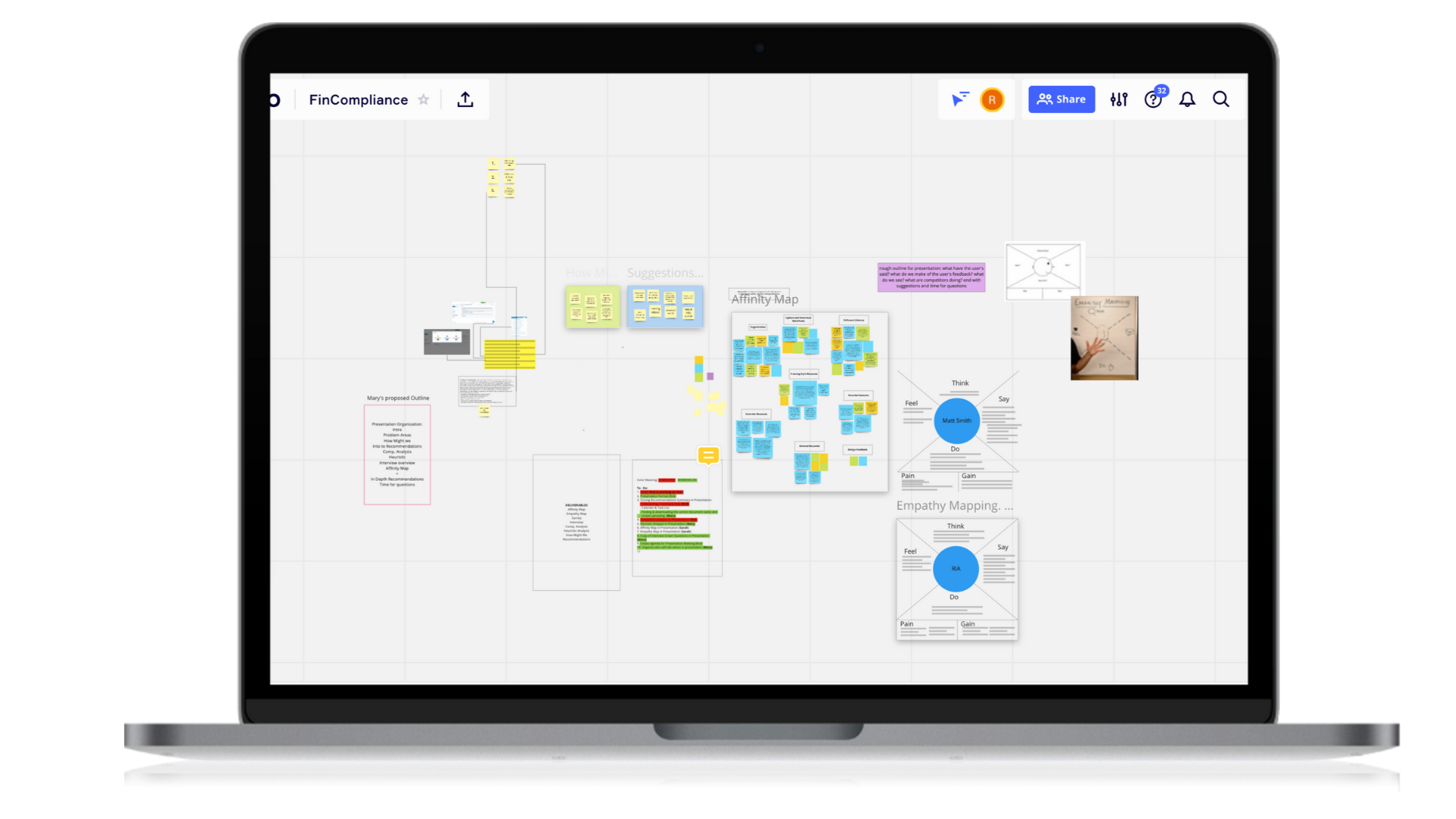
We created a project plan that helped us stay organized to achieve our goals successfully focusing on the heuristic evaluation of the FINCompliance platform, competitive research, user interviews, and providing solutions for the next steps.
Research Methods

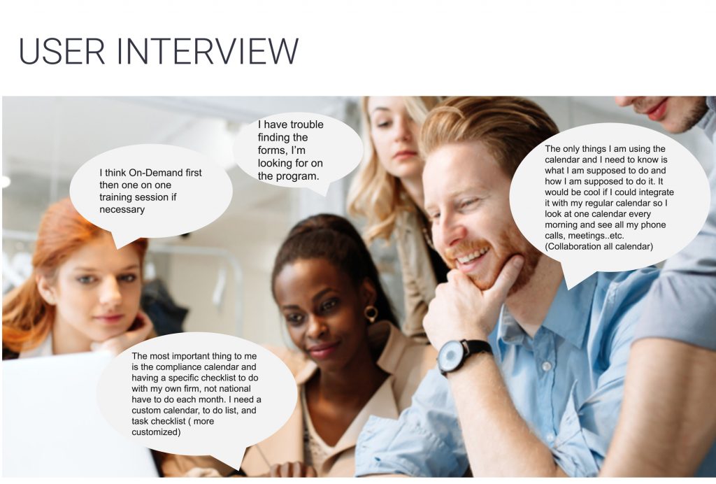
User Interviews

Competitive Analysis

Empathy Maps

Affinity Map

Heuristic Analysis
Competitive Analysis
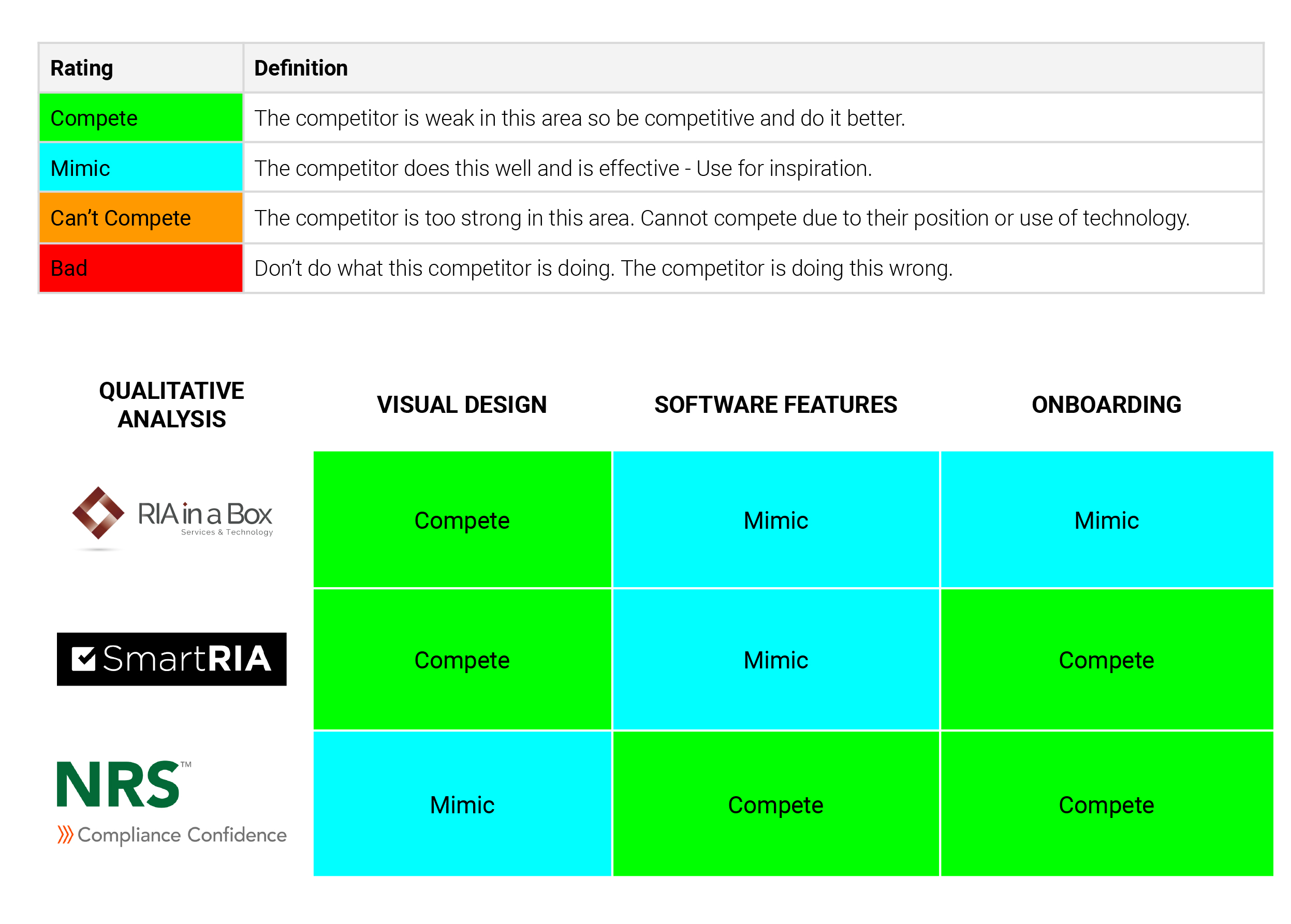
We focused on three competitors that provide compliance and business management software solutions that support boutique investment advisors in completing their regulatory filings, audit preparations, and business tasks.
Evaluations
Once we had identified the main competitors, we focused on each competitor’s splash pages based on Visual Design, Software Features, and Onboarding.

Synopsis
The opportunity for FINCompliance is to refresh its minimalistic visual design approach with a focus on how all the information and software features are organized.
For onboarding, implementing a dedicated user flow to onboard new users will help its users understand the platform, which will expand ongoing usage. Providing a mixture of content and methods for ongoing training and support is imperative to its success.
Heurstic Analysis
We conducted a heuristic evaluation to find the most pressing UX and UI problems and prioritize what should be addressed first for the greatest improvement in their user’s experience.
We evaluated the site based on Jakob Nielsen’s Usability Heuristics.
Synopsis
The opportunity for FINCompliance is to refresh its minimalistic visual design approach with a focus on how all the information and software features are organized.
For onboarding, implementing a dedicated user flow to onboard new users will help its users understand the platform, which will expand ongoing usage. Providing a mixture of content and methods for ongoing training and support is imperative to its success.
Affinity Map
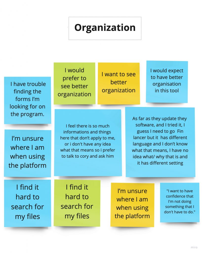
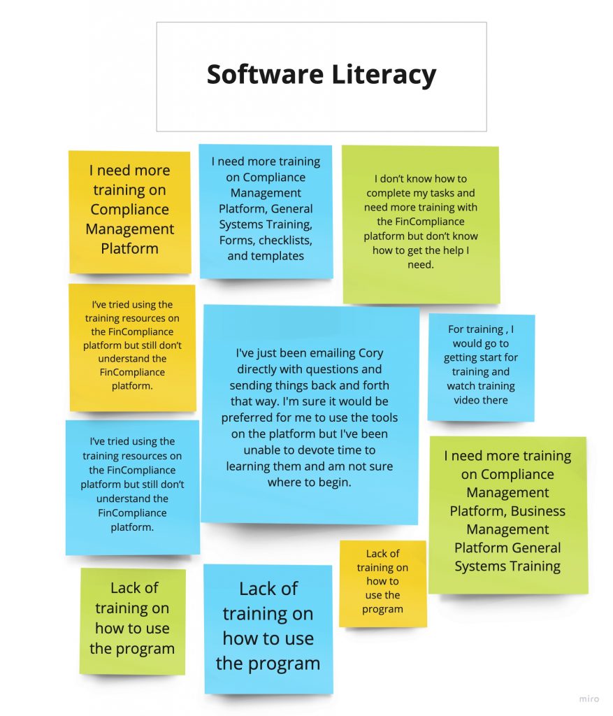
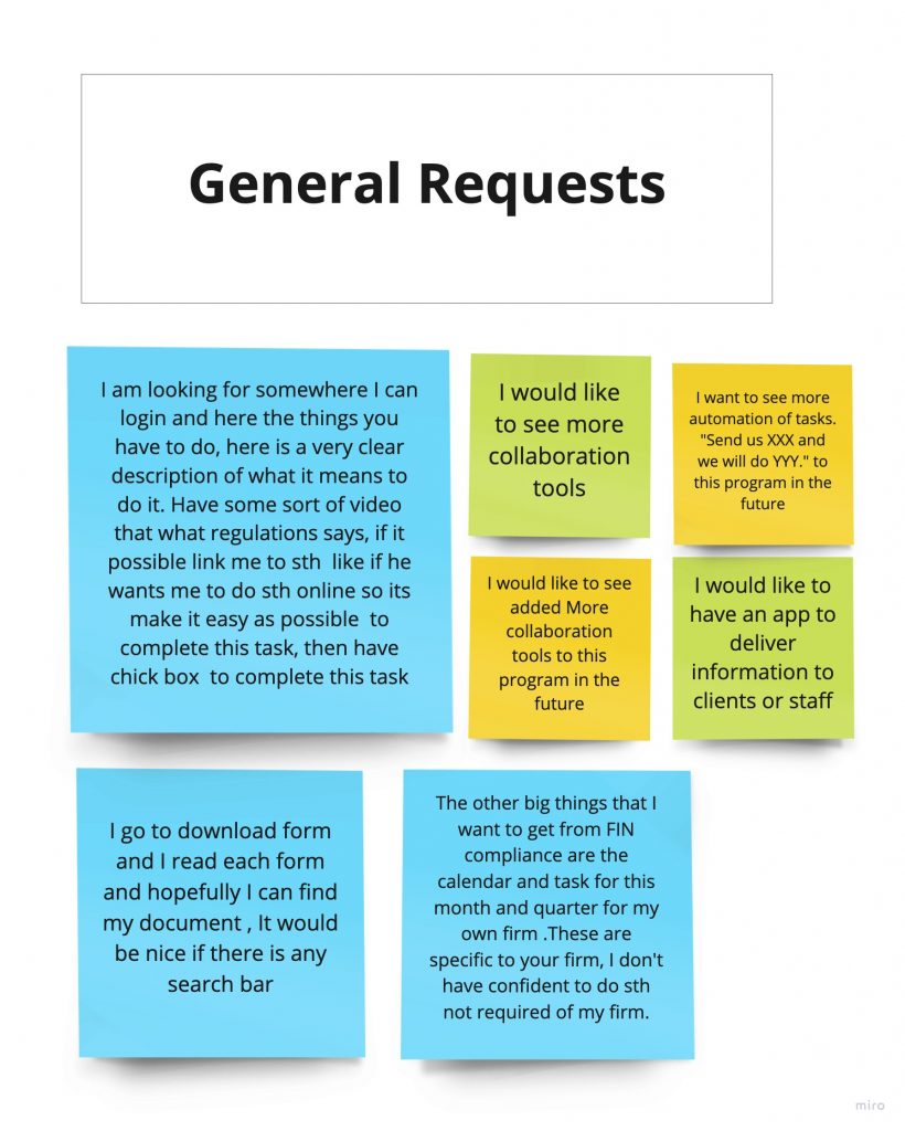
Empathy Map
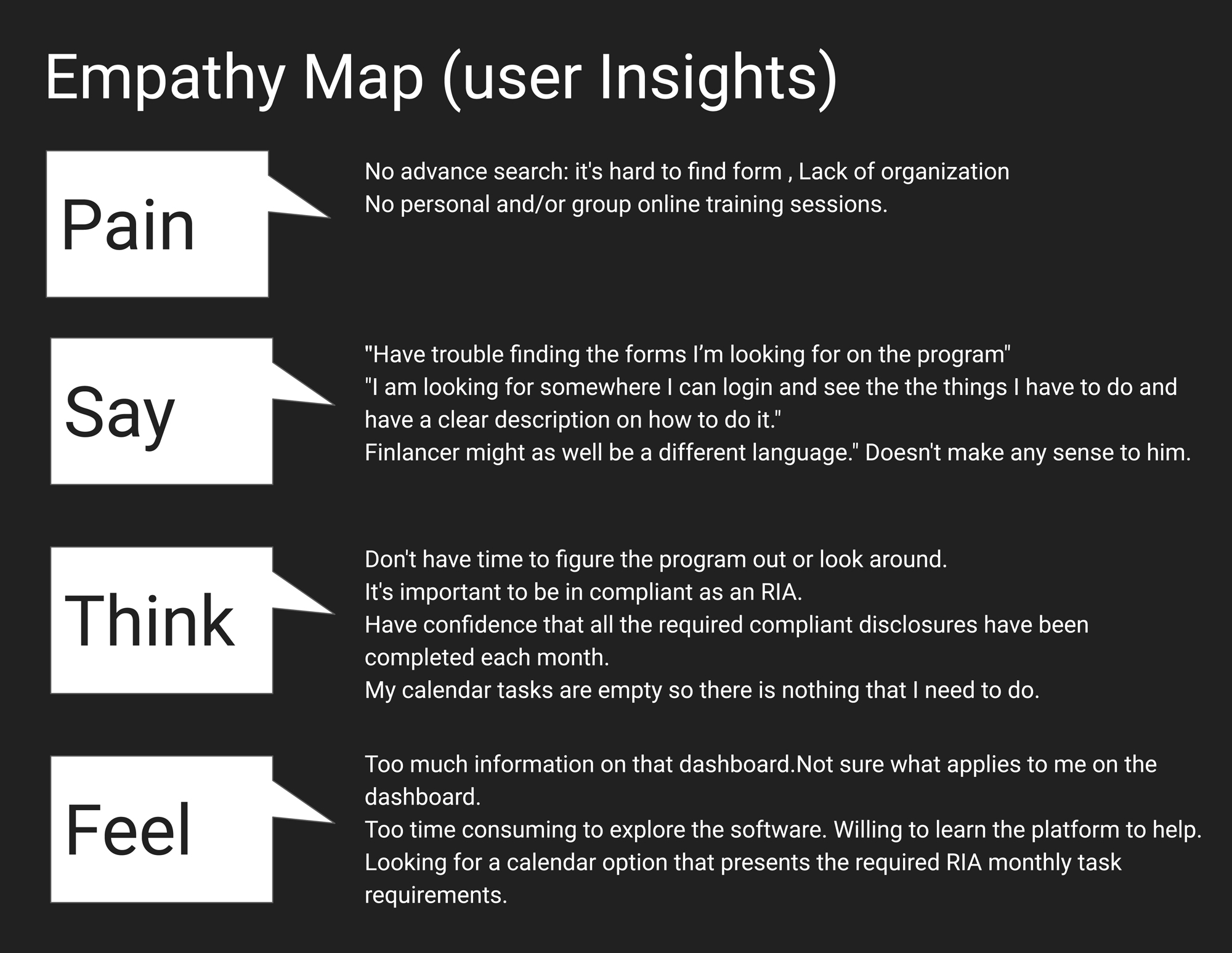
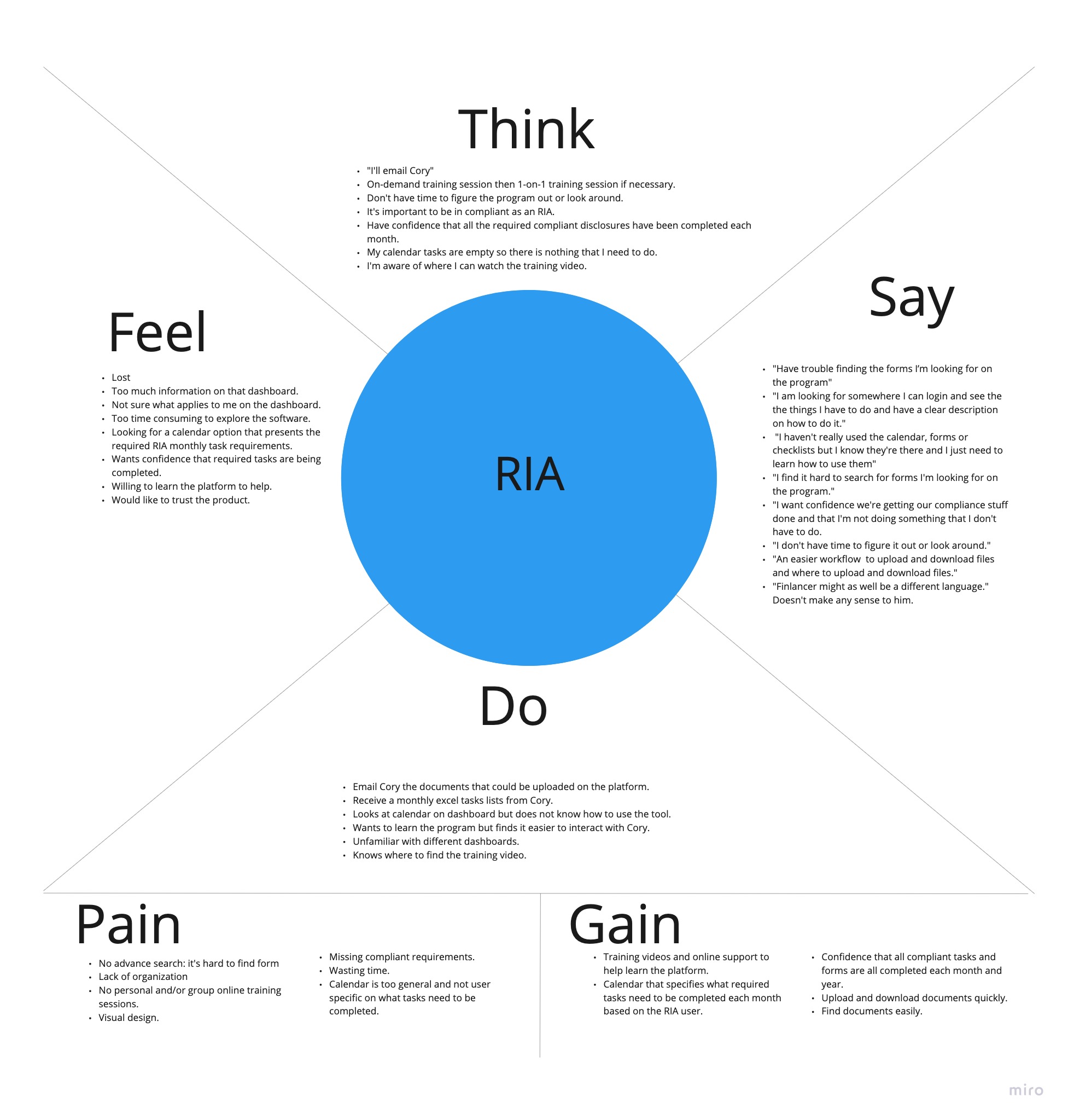
Solutions Provided
FINCompliance has several valuable assets and information for RIA’s. We found various ways its usability could be considerably increased to add value to the software and help its users use the platform more independently and confidently.
Onboarding, Training & Support
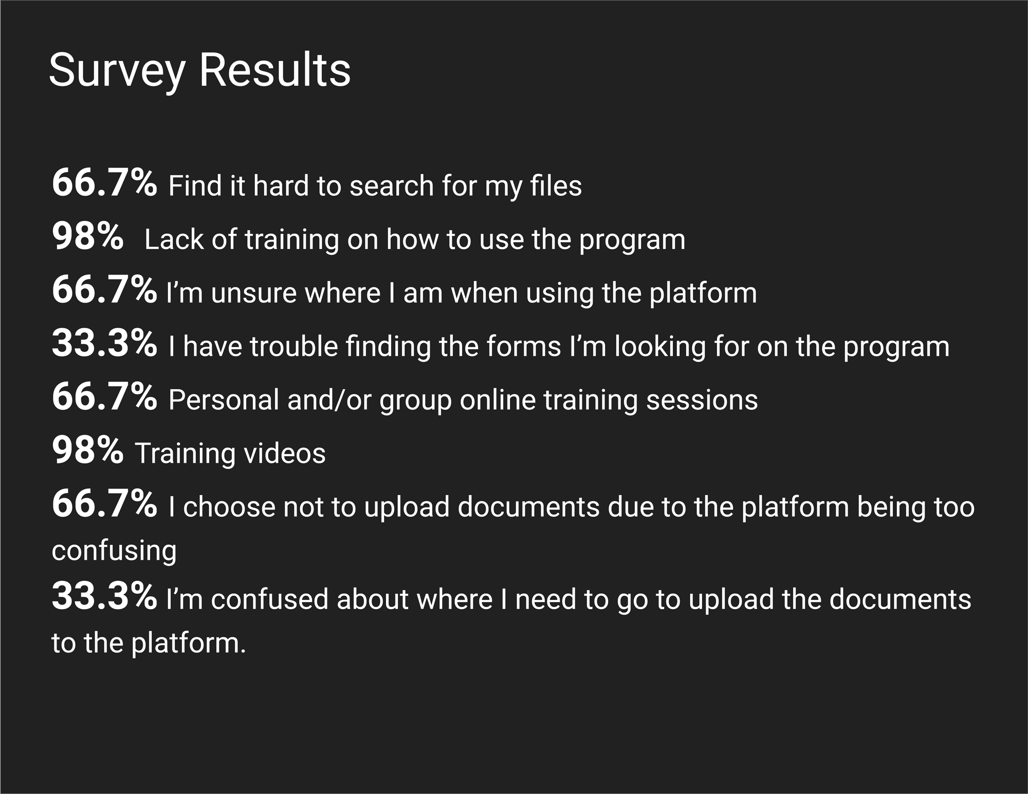
It is imperative for proper onboarding training and support for users to understand and use the software. We found users do not know how to use the software and do not feel confident in what they are doing with the platform through our research.
Calendar, Checklist & Tasklist
The settings should have a customized calendar option so each firm company can have a specific checklist to do. This calendar should integrate with their everyday checklist and task with their regular calendar.
Finding & Downloading
Currently, users are met with information overload and have to sort through irrelevant documents and links to find the files more appropriate for them and their businesses. Removing irrelevant information by personalized what documents a user is presented with would remove strain, frustration, and confusion on the user and also help FINCompliance do less IT help and consulting on the software.
LEARNINGS
Through this project, I learned and enhanced my UX skillsets, worked successfully within a team project environment, and provided key deliverables and insights to the stakeholders of FINCompliance.
Wealth Management • Money Movement • Account Funding
PNC
Simplifying Wealth Management Funding & Asset Transfers

