RiseOne
MY ROLE
User Research
UX Design
UI Design
OVERVIEW
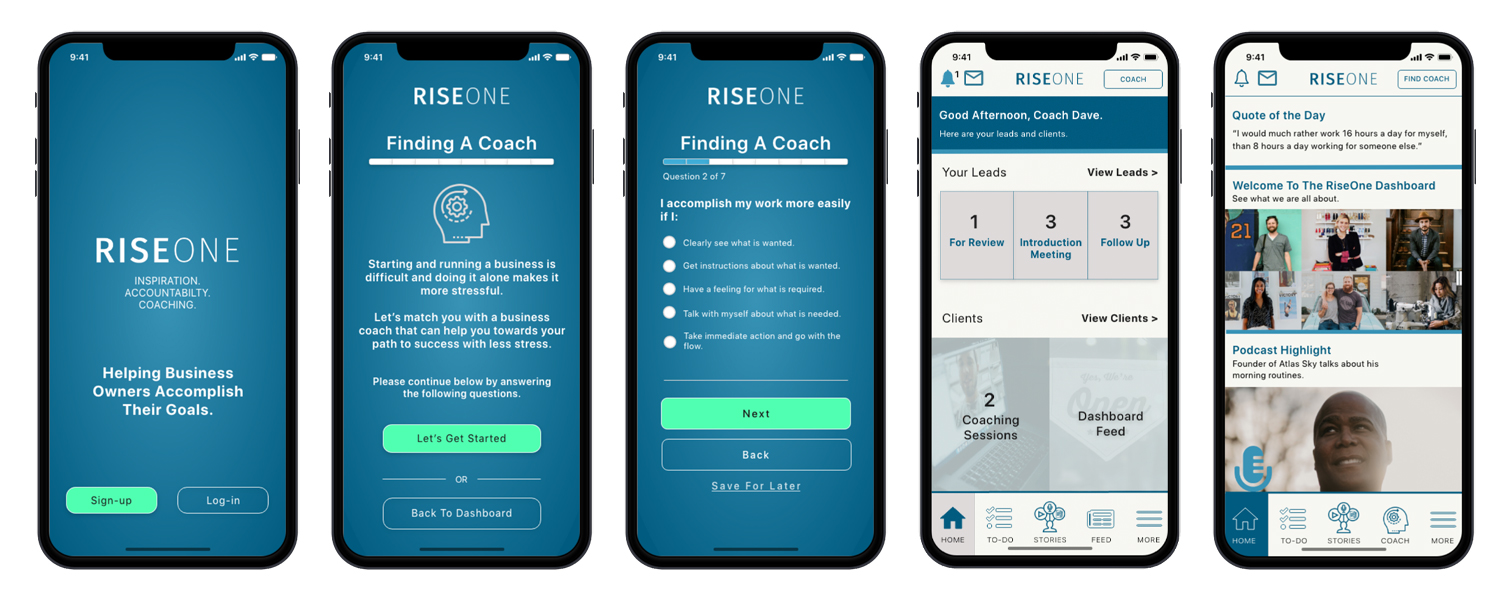
Conducted UX research, information architecture, prototype, and user tests to create and design a digital product that helps entrepreneurs find business coaches to help them achieve their goals.
RiseOne
MY ROLE
User Research
UX Design
UI Design
OVERVIEW
Conducted UX research, information architecture, prototype, and user tests to create and design a digital product that helps entrepreneurs find business coaches to help them achieve their goals.
PROBLEM STATEMENT
Every day new small businesses are starting, and thousands are unfortunately closing. I want to explore how having an entrepreneur coach increases the success rate for small business owners to reach their business goals.
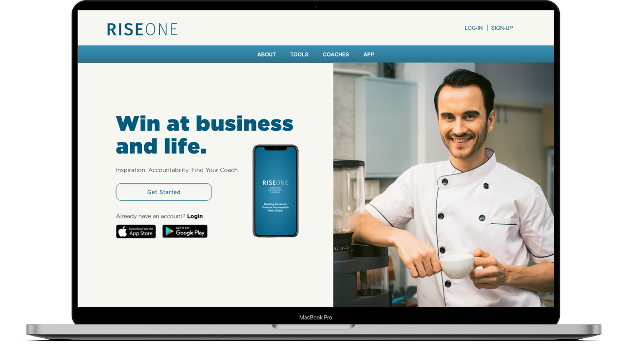
I created and designed a platform that introduces the value of coaching programs to help small business owners reach their entrepreneurial and life goals.
APPROACH
Identify reasons why small business owners don’t hire a coach and what solutions would increase the likelihood of hiring a business coach.
Turn the "How Might We" statements into opportunities for design.
Conduct user testing with high fidelity prototype.
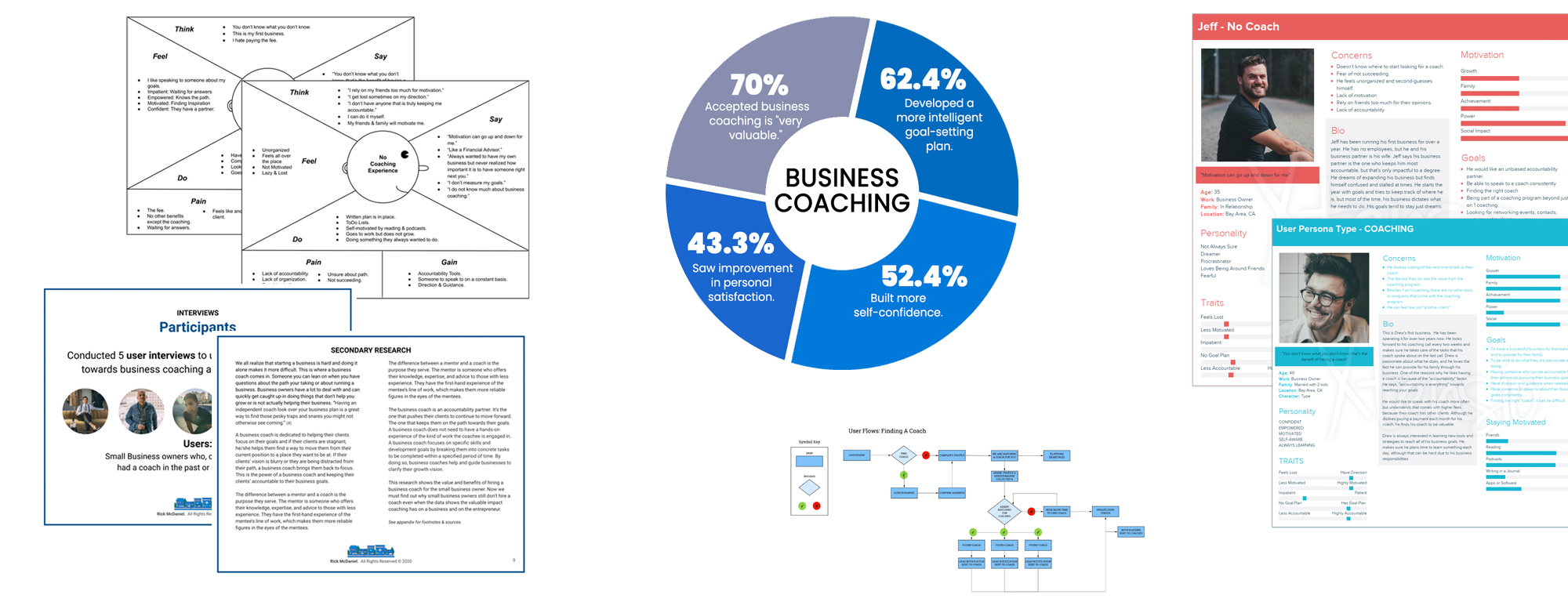
Research Methods

User Interviews

Market Research

Empathy Maps

Personas

Information Architecture
Research Synthesis
I HAVE A COACH
"Accountability is everything towards reaching your goals.”
This is Drew's first business. He has been operating it for over two years now.
Drew is passionate about what he does, and he loves the fact he can provide for his family through his business.
DON’T HAVE A COACH
He starts the year with goals and tries to keep track of where he is, but most of the time, his business dictates what he needs to do. His goals tend to stay just dreams.
He dreams of expanding his business but finds himself confused and stalled at times.
DESIGN
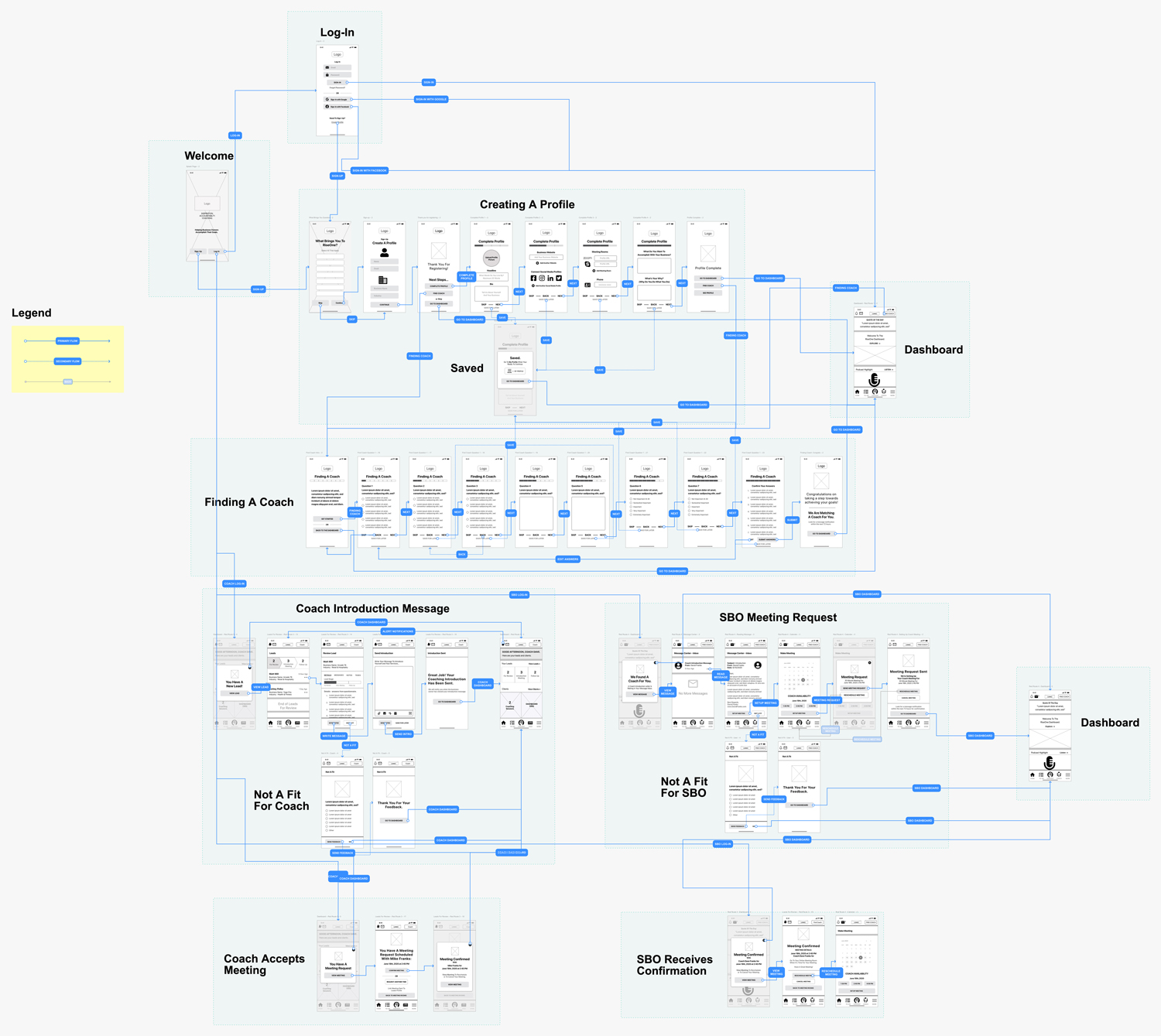
I took my red routes and sketched the screens that a user will interact with as they move through the flows.
Style Guide
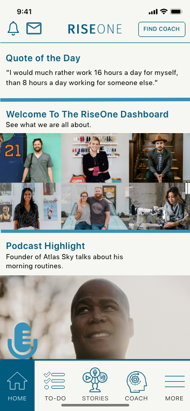
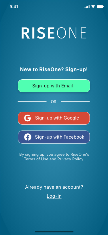
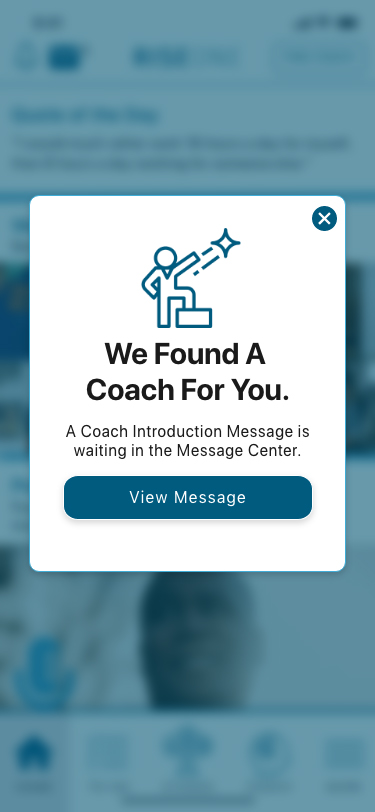
RiseOne was built upon an inspirational and coaching connecting approach to help entrepreneurs accomplish their goals.
PROTOTYPE
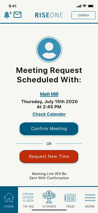
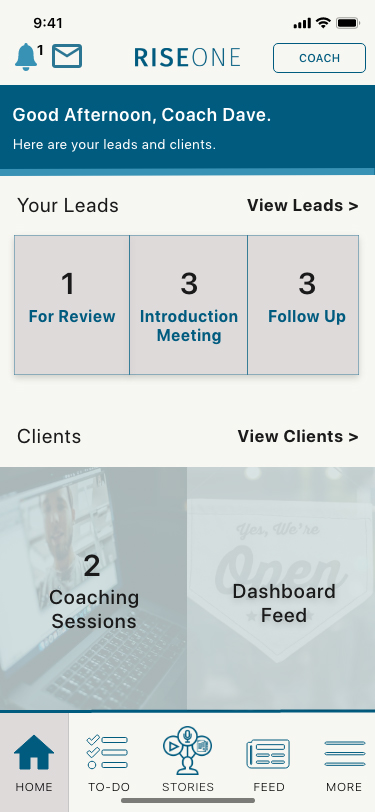
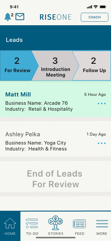
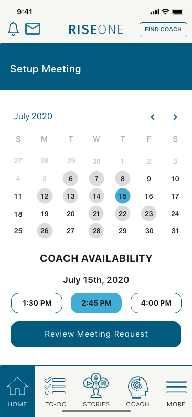
I transferred the high-fidelity mockups into an interactive prototype using Invision.
Usability Tests
I conducted two usability tests to help understand the kinds of problems users might run into when interacting with the product.
After improving and fixing the "critical” and “major” issues from both usability tests, my participants found the app straightforward, usable, self-directed, and easy to walk through.
They commented about the simplicity of the app and the UI element color schemes.

LEARNINGS
Through this project, I learned and enhanced my UX/UI skill sets and ended up with a digital product I believe will be an excellent tool for all current and future small business owners.
The importance of doing user research helped me better assess who I was solving the problem for and what will be the best approach in designing a digital experience that my future users will enjoy.
Identifying the MVP red routes and assessing the edge case, helped me define precisely how my application can be a functional, seamless and enjoyable user experience.
Utilizing the feedback from the user tests and making adjustments to the user experience, I believe, is the difference between having a product that fails to a user-friendly digital experience product that someone enjoys using.
Compliance Workflows • Regulatory Systems
FinCompliance
Compliance, consulting, and business management solutions for boutique investment firms.


